


Creating a visual representation of how a customer interacts with your brand is a strategic exercise. However, many teams find that the resulting Customer Journey Map (CJM) lacks clarity. When stakeholders look at the diagram, they do not see a clear path. They see confusion. This guide addresses the specific friction points that degrade map quality and provides actionable steps to restore clarity.
A journey map is not just a diagram; it is a shared language. When that language becomes ambiguous, decision-making stalls. This often happens when the map is built in isolation, relies on outdated data, or fails to account for the emotional states of the user. By diagnosing the source of the confusion, you can transform a static document into a dynamic tool for organizational alignment.
🔍 Identifying the Symptoms of a Confusing Map
Before attempting to fix the map, you must recognize the specific indicators that it is failing its purpose. A confusing map often exhibits the following traits:
- Stakeholder Disagreement: Different departments interpret the same touchpoints differently. Marketing sees a sale, while Support sees a complaint.
- Data Gaps: Large sections of the map are filled with assumptions rather than verified customer feedback.
- Lack of Ownership: No team member knows who is responsible for improving a specific stage of the journey.
- Visual Overload: The diagram is too dense with icons, arrows, and text to read quickly.
- Static Nature: The map was created once and has not been updated since the last product launch.
When these symptoms appear, the map has become a decorative artifact rather than a functional asset. It is time to troubleshoot the underlying structure.
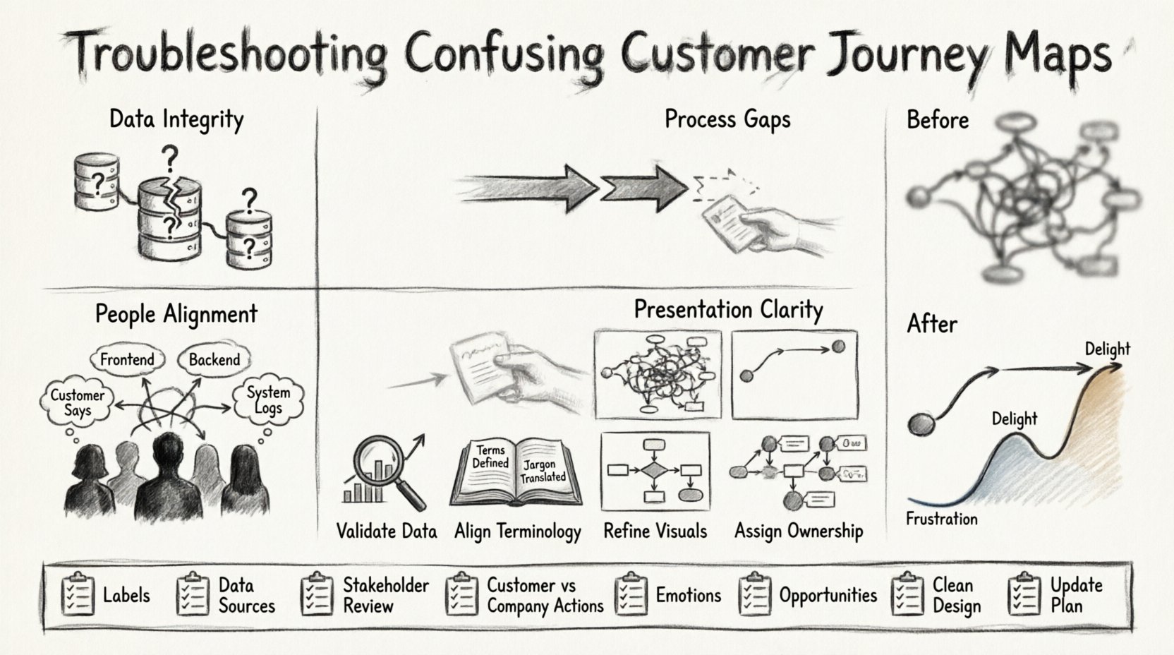
🧱 Root Cause Analysis: Why the Confusion Exists
Understanding the source of the problem is critical. The confusion usually stems from one of four pillars: Data, Process, People, or Presentation.
1. Data Integrity Issues
If the foundation is weak, the structure will not stand. A confusing map often results from poor data collection methods.
- Siloed Information: Sales data lives in one system, while support logs live in another. Merging these without a unified view creates contradictions.
- Outdated Personas: The map is based on customer profiles from three years ago. Market conditions and customer behaviors have shifted.
- Missing Channels: The map only accounts for desktop interactions, ignoring mobile app usage or social media inquiries.
2. Process and Workflow Gaps
Even with good data, internal workflows can confuse the external journey.
- Hidden Handoffs: A customer interacts with a chatbot, which transfers them to an agent. If this transition is invisible on the map, it looks like a gap.
- Internal Complexity: The customer experience is simple, but the internal backend is complex. The map fails to show how backend friction creates frontend delays.
- Variable Paths: The map assumes a linear path, but real customer behavior is non-linear. Users jump between stages.
3. People and Alignment
Human interpretation varies. Without a shared definition, confusion is inevitable.
- Terminology Mismatch: One team defines “onboarding” as account setup, while another defines it as the first successful purchase.
- Lack of Empathy: The map focuses on business goals rather than customer needs. It lists what the company wants to do, not what the customer wants to achieve.
- Stakeholder Exclusion: Key departments were not involved in the creation process, so they do not understand the map.
4. Presentation and Clarity
How the information is displayed affects comprehension.
- Too Many Touchpoints: Listing every single email or notification clutters the view.
- Complex Diagramming: Using complex flowchart logic instead of a chronological timeline.
- Missing Emotional Context: The map shows actions but omits the feelings associated with those actions.
🛠️ Step-by-Step Troubleshooting Protocol
Once you have identified the root cause, follow this structured protocol to clean up the map. This process requires time and collaboration.
Step 1: Validate the Data Source
Do not trust assumptions. Go back to the raw inputs.
- Audit the Sources: List every data source used to build the map. Verify that the data is current.
- Conduct Interviews: Speak directly to customers. Ask them to walk through their experience from memory. Compare this to the map.
- Check Analytics: Look at conversion rates at each stage. If a stage has a massive drop-off, verify if the map reflects that friction.
Step 2: Align Terminology
Create a glossary to ensure everyone speaks the same language.
- Define Stages: Clearly label stages (e.g., Awareness, Consideration, Purchase). Avoid vague terms like “Start” or “End”.
- Define Touchpoints: Specify exactly what constitutes a touchpoint. Is a social media post a touchpoint? Is a phone call?
- Document Definitions: Keep this glossary accessible to all team members involved in the journey.
Step 3: Refine the Visuals
Reduce cognitive load by simplifying the visual design.
- Limit Color Usage: Use color to highlight specific states (e.g., pain points vs. moments of delight), not just to make it look pretty.
- Use Whitespace: Ensure there is breathing room between stages. Crowded maps are hard to read.
- Focus on the Flow: Use arrows to indicate direction. If the path is non-linear, use branching lines to show alternatives.
Step 4: Assign Ownership
A map without owners is ignored. Ensure accountability.
- Tag Touchpoints: Assign a specific owner to each touchpoint (e.g., Email Marketing owns the “Welcome Email” touchpoint).
- Set Metrics: Define what success looks like for each stage. Does “Consideration” mean time on site or brochure download?
- Schedule Reviews: Set a recurring meeting to review the map and update it based on new data.
⚠️ Common Pitfalls and Solutions
To help you navigate common issues, refer to this troubleshooting table. It outlines frequent problems and their practical solutions.
| Problem | Diagnosis | Solution |
|---|---|---|
| Stakeholders Ignore the Map | They do not see the value or relevance to their daily work. | Link map stages directly to KPIs and operational tasks. |
| Customer Feedback Contradicts Map | Internal assumptions do not match external reality. | Conduct user testing sessions to verify the flow. |
| Too Many Stages | The map is too granular and loses the big picture. | Consolidate stages. Group minor steps into broader phases. |
| Confusion Between Internal vs. External | The map shows backend processes instead of customer actions. | Remove backend steps. Focus only on what the customer sees or feels. |
| No Clear Next Steps | Identifying a problem is not enough; action is missing. | Add an “Opportunity” row below each stage to list improvements. |
🔄 Moving from Static to Dynamic
A common reason for confusion is that the map is treated as a one-time project. Customer journeys evolve. The market shifts. The product changes. If the map is static, it will inevitably become confusing.
Implementing Continuous Updates
To keep the map relevant, treat it as a living document. This requires a shift in mindset from “creating a map” to “managing a map.”
- Feedback Loops: Integrate customer feedback directly into the map update cycle. If a customer complains about a specific step, update the map immediately.
- Version Control: Maintain history of changes. This helps understand why a journey changed over time.
- Integration with Tools: Connect the map to your operational dashboards. If a metric changes, the map should reflect the impact.
Monitoring Success Metrics
How do you know the map is working? Look for improvements in key areas.
- Customer Satisfaction (CSAT): Are scores improving at specific stages identified as friction points?
- Conversion Rates: Is the funnel moving more smoothly after changes?
- Internal Efficiency: Are teams spending less time debating the process and more time executing improvements?
🧩 Handling Non-Linear Journeys
One of the biggest sources of confusion is the assumption that all customers follow the same path. In reality, journeys are often chaotic.
Mapping Variations
Instead of one single line, consider mapping multiple paths.
- Happy Path: The ideal scenario where everything goes right.
- Alternative Paths: Scenarios where a user skips a step or returns to a previous one.
- Exception Paths: What happens when a customer encounters an error or a bug?
By visualizing these variations, you acknowledge the complexity of real behavior. This reduces confusion when stakeholders realize the “perfect” path does not exist.
📋 Checklist for Map Review
Use this checklist before presenting your journey map to leadership or the wider team. It ensures the document is ready for consumption.
- ☐ Are all stages clearly labeled with standard industry terms?
- ☐ Is every touchpoint linked to a specific data source?
- ☐ Have all stakeholders reviewed and agreed on the definitions?
- ☐ Is there a clear distinction between what the customer does and what the company does?
- ☐ Are emotional states (frustration, joy) included for each stage?
- ☐ Is there an action item or opportunity listed for every pain point?
- ☐ Is the visual design clean and free of clutter?
- ☐ Is there a plan for updating the map in the next quarter?
🤝 Bridging the Gap Between Teams
Confusion often arises because different teams own different parts of the map. Sales owns the top, Support owns the bottom, and Product owns the middle. This siloed ownership creates blind spots.
Collaborative Workshops
Bring everyone together in a workshop setting.
- Whiteboarding: Use a physical or digital whiteboard to map out the journey together. This forces collaboration.
- Role Playing: Have team members act out the customer journey. This highlights gaps in handoffs.
- Conflict Resolution: Allow teams to debate where the map is unclear. Resolve the debate by referring to data, not opinion.
🎯 Final Thoughts on Clarity
When a customer journey map feels confusing, it is a signal that the underlying understanding of the customer is incomplete. The map is a mirror of your internal knowledge. If the mirror is foggy, the reflection is unclear.
Fixing the map requires humility. It requires admitting that assumptions are wrong and that data needs verification. It requires bringing together disparate teams to agree on a single truth. When done correctly, the map becomes a shared asset that guides investment, design, and strategy.
Start by diagnosing the specific symptoms of confusion. Address the data, the definitions, and the visual presentation. Keep the map updated as the business evolves. By treating the journey map as a living system rather than a static deliverable, you ensure it remains a clear guide for your organization.
🚀 Next Steps for Your Team
To move forward immediately, take these actions:
- Convene a Review Meeting: Schedule a session with key stakeholders to review the current map.
- Identify One Pain Point: Pick one stage of the journey that is causing the most confusion and focus on clarifying it first.
- Gather Fresh Data: Collect recent customer feedback specifically related to the identified pain point.
- Update the Diagram: Reflect the new understanding visually.
- Communicate Changes: Share the updated map with the wider organization to ensure alignment.
Clarity is not achieved overnight, but it is achievable through systematic troubleshooting and consistent effort. By following these steps, you can transform a confusing diagram into a powerful tool for growth.

