


In the landscape of software architecture, visualizing how a system is physically realized is just as critical as defining its logical structure. A Deployment Diagram provides this physical view, mapping software artifacts to the hardware infrastructure that executes them. This guide explores the mechanics, utility, and practical application of Deployment Diagrams without relying on specific vendor tools or hype.
Understanding the Core Purpose 🎯
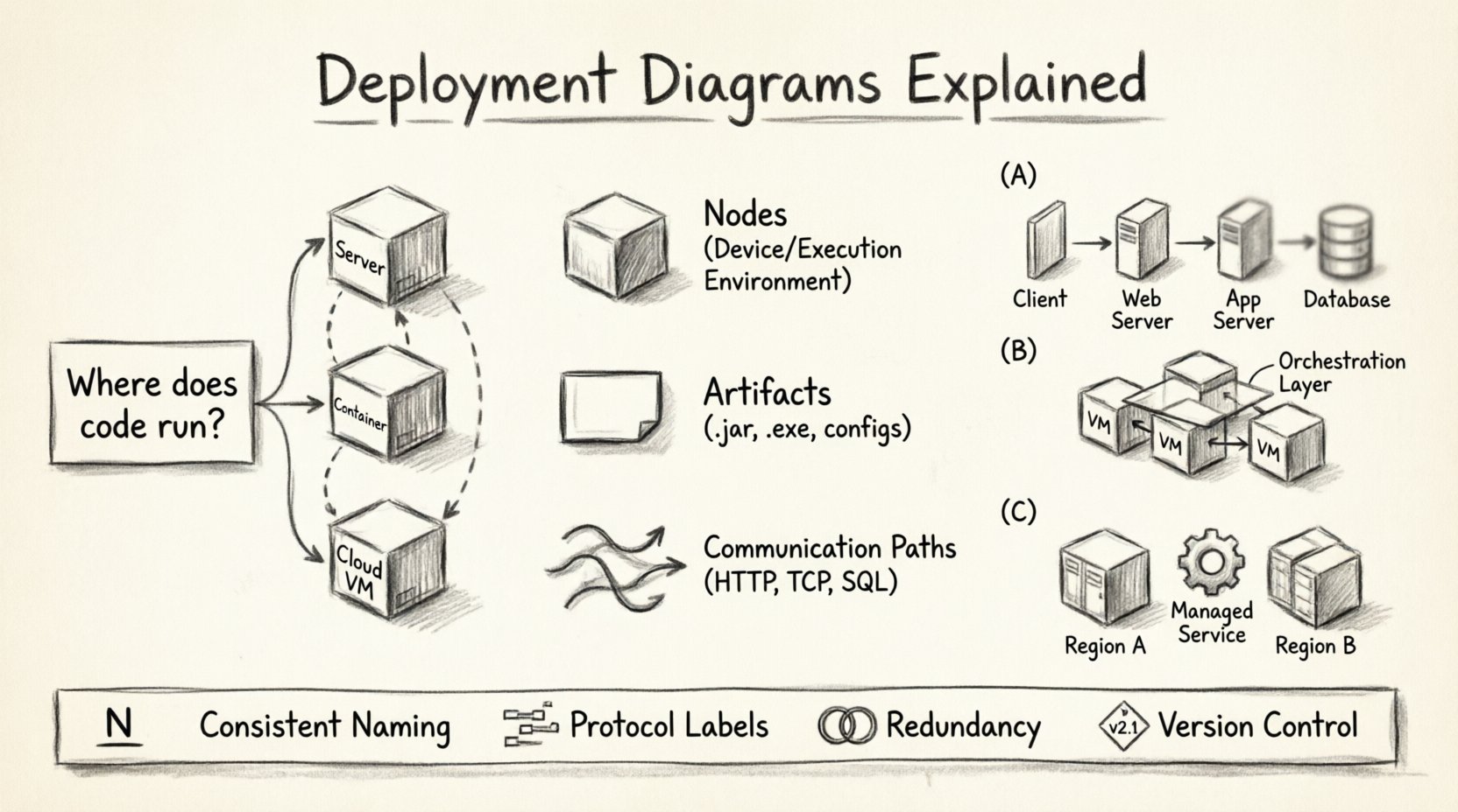
A Deployment Diagram is a type of Unified Modeling Language (UML) diagram. It depicts the physical deployment of artifacts on nodes. While a Class Diagram shows relationships between objects, and a Sequence Diagram shows interactions over time, the Deployment Diagram focuses on topology. It answers the question: Where does the code actually run?
These diagrams serve several vital functions within the Software Development Life Cycle (SDLC):
- Infrastructure Planning: Architects use them to estimate resource requirements before provisioning environments.
- Communication: They bridge the gap between development teams and operations teams by visualizing the environment.
- Configuration Management: They act as a source of truth for the expected state of the production environment.
- Security Analysis: They help identify where sensitive data resides and how it traverses the network.
Anatomy of a Deployment Diagram 🧩
Every Deployment Diagram consists of specific building blocks. Understanding these elements is essential for creating accurate and useful models.
1. Nodes (Processing Devices)
Nodes represent physical or virtual computing resources. They are the containers that execute the software. There are two main types:
- Device: Represents physical hardware with processing capacity. Examples include servers, routers, and mobile phones.
- Execution Environment: Represents a software environment that hosts the node. Examples include operating systems or container runtimes.
Each node is typically represented by a 3D cube shape. The name of the node appears at the top of the cube.
2. Artifacts
Artifacts represent the physical representation of software components. These are the files or binaries that are deployed onto the nodes. Common examples include:
- Executable files (.exe, .jar, .dll)
- Library files
- Database schemas
- Configuration files
- Scripts
Artifacts are usually depicted as a rectangle with a folded top corner (like a piece of paper).
3. Communication Paths
These lines connect nodes to show how they communicate. They represent the network infrastructure. Types of connections include:
- Association: A standard connection between nodes.
- Dependency: Indicates that one node requires another to function.
- Realization: Indicates that an artifact realizes an interface.
Creating a Deployment Diagram: A Step-by-Step Process 📝
Constructing a Deployment Diagram requires a methodical approach. It is not enough to simply draw boxes and lines; the diagram must reflect the actual architecture.
Step 1: Identify the Architecture Style
Begin by determining the architectural pattern. Is it a monolithic application where everything runs on a single server? Or is it a microservices architecture distributed across multiple containers? The style dictates the complexity of the diagram.
Step 2: Define the Nodes
List all the hardware or virtual environments involved. Consider:
- Web servers handling incoming requests
- Application servers running business logic
- Database servers storing persistent data
- Load balancers distributing traffic
- External systems (payment gateways, email services)
Step 3: Map the Artifacts
Assign the software components to the nodes. Ensure that:
- Dependencies are visible (e.g., the app server depends on the database server).
- Versioning is considered (e.g., is the database version compatible with the app version?).
- Security boundaries are respected (e.g., public-facing servers vs. internal databases).
Step 4: Define the Connections
Draw the lines between nodes. Label these connections with protocols or standards. For example:
- HTTP/HTTPS for web traffic
- TCP/IP for internal communication
- SQL for database interactions
- REST API for service-to-service calls
Real-World Scenarios and Examples 🌍
To fully grasp the utility of Deployment Diagrams, we examine how they apply to different system structures.
Scenario A: The Classic Web Application
In a standard web application setup, the diagram typically shows a three-tier architecture.
- Client Node: Represents the user’s browser or mobile device.
- Web Server Node: Hosts the front-end code and handles static content.
- Application Server Node: Executes the backend logic.
- Database Node: Stores the data.
Communication flows from the Client to the Web Server, then to the Application Server, and finally to the Database. This hierarchy helps in identifying bottlenecks.
Scenario B: Microservices Architecture
In a distributed environment, the diagram becomes more complex. Multiple nodes may host different services.
- Container Nodes: Individual services run in isolated containers.
- Orchestration Node: Manages the lifecycle of the containers.
- Service Mesh: Handles communication between services securely.
This layout highlights the need for robust networking and the decoupling of services. It shows that a failure in one service node does not necessarily crash the entire system.
Scenario C: Cloud-Native Deployment
When moving to the cloud, the diagram abstracts the physical hardware. Instead of specifying server models, the diagram focuses on cloud resources.
- Virtual Machines: Replace physical servers.
- Managed Services: Databases and caching services are provided by the infrastructure.
- Region Availability: Shows deployment across different geographic zones for redundancy.
Comparison: Deployment vs. Other Diagrams ⚖️
It is easy to confuse Deployment Diagrams with other UML diagrams. Understanding the distinction ensures the right tool is used for the right job.
| Diagram Type | Primary Focus | Key Question Answered |
|---|---|---|
| Deployment | Physical topology | Where does it run? |
| Component | Logical structure | What are the parts? |
| Class | Data and behavior | How is data organized? |
| Sequence | Interaction over time | How do parts talk? |
| Activity | Workflow and process | What steps are taken? |
While a Component Diagram shows that a system has an “Authentication Module,” a Deployment Diagram shows that the “Authentication Module” artifact is installed on the “API Gateway” node.
Common Pitfalls to Avoid 🚫
Creating Deployment Diagrams is straightforward, but creating effective ones requires discipline. Several common mistakes can render a diagram useless.
1. Over-Abstraction
Leaving out too many details can make the diagram generic. If you do not specify the type of database or the operating system, operations teams cannot plan for the environment accurately. However, do not list every single cable or switch unless it impacts the architecture.
2. Ignoring Security Boundaries
A diagram that shows all nodes connected to each other without indicating firewalls or network segments is misleading. Critical systems should be separated. Use different colors or zones to indicate security levels (e.g., Public Zone vs. Internal Zone).
3. Static Representation of Dynamic Systems
Systems scale. A diagram that shows a single server for a high-traffic application is incorrect. Use stereotypes or annotations to indicate clustering or load balancing. For example, label a node as “Cluster” rather than “Server 1”.
4. Lack of Version Control
Software changes. A deployment diagram that is not versioned becomes obsolete quickly. Treat the diagram as code. Update it whenever the infrastructure changes. Maintain a history of versions to track migration paths.
Best Practices for Clarity and Maintenance ✅
To ensure your Deployment Diagrams remain valuable assets, follow these guidelines.
- Use Consistent Naming: Name nodes based on their function (e.g., “Web Server 01”) rather than their hostname (e.g., “srv-web-01”) for better readability.
- Group Related Nodes: Use packages or compartments to group nodes that belong to the same logical unit, such as a “Database Cluster”.
- Indicate Protocols: Always label the lines connecting nodes with the communication protocol used (e.g., HTTPS, SSH, AMQP).
- Show Redundancy: If a system has backup nodes, show them. This is crucial for disaster recovery planning.
- Keep it High Level First: Start with a high-level overview. Drill down into sub-diagrams for complex sections. A single page cannot hold every detail of a massive enterprise system.
Integration with DevOps and Automation 🔄
Modern infrastructure relies heavily on automation. Deployment Diagrams are no longer just static documents; they inform infrastructure as code (IaC).
1. Infrastructure as Code
Scripts used to provision servers can be derived directly from the nodes in the diagram. If a node is defined as a “Database Server,” the automation script should provision a VM with the appropriate database software.
2. Continuous Deployment
Deployment pipelines use the artifact definitions from the diagram. When a build is completed, the pipeline knows which artifact to push to which node based on the diagram’s mapping.
3. Monitoring and Alerting
Monitoring tools use the topology defined in the diagram to visualize system health. If a node goes down, the monitoring dashboard highlights the specific physical component that failed.
Advanced Considerations 🧠
For complex systems, additional details can be added to the diagram to provide deeper insights.
1. Resource Constraints
Annotate nodes with resource specifications. For example, indicate the CPU cores, memory capacity, or storage type (SSD vs. HDD). This is vital for performance tuning.
2. Latency and Bandwidth
Label connections with estimated latency or bandwidth constraints. This helps in understanding data flow bottlenecks, especially in geographically distributed systems.
3. Compliance and Regulations
Some industries require data to remain within specific geographic boundaries. The diagram can indicate the region of each node to ensure compliance with data sovereignty laws.
The Role of the Architect 🏛️
The Software Architect is responsible for the creation and maintenance of these diagrams. They must balance technical requirements with business constraints. The diagram is a communication tool used to align stakeholders.
When presenting a Deployment Diagram to non-technical stakeholders, focus on the business value. Explain how redundancy ensures uptime, or how geographic distribution improves user speed. When presenting to engineers, focus on the protocols, versions, and configurations.
Final Thoughts on System Visualization 🌟
Deployment Diagrams are a fundamental tool for system design. They transform abstract code into a tangible infrastructure plan. By understanding the nodes, artifacts, and connections, teams can build systems that are robust, scalable, and maintainable.
Remember that a diagram is a living document. It should evolve as the system evolves. Regular reviews ensure that the visual representation matches the reality of the running system. This alignment prevents configuration drift and reduces the risk of deployment failures.
Adopting a disciplined approach to modeling your infrastructure pays dividends in stability and efficiency. Whether you are building a simple web app or a distributed cloud system, the Deployment Diagram remains the blueprint for your physical reality.

