


📋 Introduction to Infrastructure Visualization
Designing a deployment diagram is a critical task for any engineering team aiming to build robust, high-performance systems. These diagrams serve as the blueprint for how software components interact with physical or virtual infrastructure. Unlike code, which evolves constantly, the architectural representation often remains static unless intentionally updated. This creates a unique challenge: how do you represent a system that is designed to grow, change, and adapt without creating a document that becomes obsolete the moment it is published? 🤔
A scalable deployment diagram does more than just show where software runs. It communicates the strategy for handling increased load, managing failures, and ensuring security across the network. When architects focus solely on the current state, they risk building a map that cannot guide future expansion. This guide explores the methodologies for creating diagrams that reflect true scalability, ensuring that the visual representation matches the operational reality of your infrastructure. We will cover everything from node abstraction to data flow visualization, avoiding the common traps that lead to misleading documentation. 📉➡️📈
🧱 Core Components of a Deployment Diagram
Before addressing scalability, one must understand the fundamental building blocks. A deployment diagram maps software artifacts to hardware nodes. These artifacts are the compiled or packaged units of the application, while nodes represent the computing resources where these units execute. To maintain clarity, especially in complex environments, you must distinguish between logical and physical representations.
- Nodes: These represent the physical or virtual machines, servers, or containers. They can be categorized by role, such as compute nodes, database nodes, or network gateways. In a scalable context, nodes should be labeled to indicate their capacity tier rather than specific hardware specs, which change frequently.
- Artifacts: These are the deployable units. Whether it is an executable, a library, or a container image, the artifact should be distinct from the node it resides on. This separation allows you to show multiple artifacts running on a single node or the same artifact distributed across many nodes.
- Communication Paths: These connections define the data flow. They should indicate the protocol used (e.g., HTTP, gRPC, TCP) and the direction of the data. For scalability, it is crucial to show load balancers and network boundaries explicitly.
When documenting these components, avoid cluttering the diagram with every single server. Instead, use grouping containers to represent clusters. This abstraction is vital for scalability, as it allows the diagram to remain valid even if the number of individual nodes doubles or triples. 🖥️
📈 Strategies for Representing Scalability
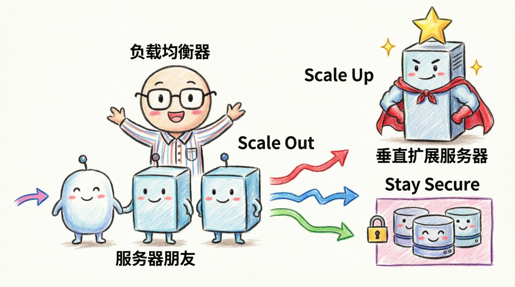
Scalability is the ability of a system to handle increased demand. A deployment diagram must visualize how the system achieves this. There are two primary methods: horizontal scaling (adding more nodes) and vertical scaling (increasing node capacity). The diagram should reflect which strategy is employed and how the system manages the distribution of work.
Horizontal Scaling Patterns
Horizontal scaling involves adding more instances of a service. In a diagram, this is often represented by showing a cluster of identical nodes behind a load balancer. To make this clear:
- Use Dotted Lines: Indicate that the nodes within a cluster are interchangeable instances. This signals to the reader that adding or removing one instance does not break the architecture.
- Label the Cluster: Instead of naming each node, label the group with a function, such as “Application Cluster” or “Worker Pool”.
- Show the Balancer: The entry point for traffic should be a distinct component that distributes requests. This highlights the mechanism that enables the horizontal expansion.
Vertical Scaling Considerations
Vertical scaling means upgrading the resources of an existing node. While less common in modern microservice architectures, it is still relevant for database layers or monolithic components. In the diagram, represent this by indicating resource constraints or tiered capacity levels, such as “High-Performance Compute” versus “Standard Compute”.
Comparing Scaling Patterns
Understanding the trade-offs between scaling strategies helps in designing the diagram accurately. The following table outlines the characteristics of different approaches.
| Strategy | Diagram Representation | Best Use Case |
|---|---|---|
| Horizontal Scaling | Multiple identical nodes behind a load balancer | Web services, stateless APIs, microservices |
| Vertical Scaling | Single node with upgraded resource labels | Databases, legacy monoliths, stateful applications |
| Auto-Scaling Groups | Dynamic node group with scaling triggers | Cloud-native environments with variable traffic |
| Active-Passive | Primary node with a standby connection | High availability requirements for critical systems |
By using these visual conventions, stakeholders can immediately understand the growth potential of the system without needing to read the code. This clarity is essential for capacity planning and budget forecasting. 💰
🔒 Security and Network Topology
Security is not an afterthought in deployment design. A scalable system must remain secure as it expands. The deployment diagram should explicitly show network boundaries, firewalls, and security zones. This helps identify potential attack vectors and ensures that compliance requirements are met during the design phase.
- Security Zones: Divide the diagram into zones such as “Public Internet”, “DMZ (Demilitarized Zone)”, and “Internal Network”. This visual separation clarifies which components are exposed to the outside world and which are protected.
- Firewalls and Gateways: Represent network security devices as distinct nodes or boundaries. Show which ports and protocols are allowed to pass through these barriers.
- Encryption: Indicate where data is encrypted in transit. Using a lock icon or a specific label on connection lines can denote SSL/TLS usage. This is crucial for diagrams that involve sensitive data transmission.
When the system scales, security policies must scale with it. For example, if you add more web servers, they must all adhere to the same security posture. The diagram should reflect this uniformity. If different tiers have different security requirements, use color coding or distinct shapes to differentiate them. This prevents the assumption that all nodes are treated equally when they are not. 🛡️
💾 Data Persistence and State Management
One of the hardest aspects of scalability to visualize is data. As the number of application nodes increases, the state of the data must be managed carefully. The deployment diagram needs to show where state is stored and how it is accessed.
Stateless vs. Stateful
Application nodes should ideally be stateless. This means they do not store user session data locally but rely on external services. The diagram should show a clear separation between the compute layer and the storage layer. If the application is stateful, the diagram must explicitly link the nodes to the storage backend.
- External Storage: Represent databases and caches as separate nodes. Connect them to the application cluster via a dedicated network path.
- Shared Storage: If multiple nodes access the same file system, indicate this with a shared storage node. Be aware that shared storage can become a bottleneck.
- Distributed Data: For high scalability, show data sharding or replication. Use arrows to indicate data flow between database nodes to show replication lag or synchronization.
Caching Strategies
Performance often depends on caching. The diagram should include cache layers, typically placed between the application and the database. Show the hierarchy of caches (e.g., local cache, distributed cache). This helps in understanding where data redundancy exists and how it impacts consistency. For instance, a distributed cache allows any node in the cluster to access session data, supporting horizontal scaling effectively. 🚀
🔄 Automation and Dynamic Scaling
Modern infrastructure is rarely static. It is managed through automation tools and infrastructure as code. While the deployment diagram represents the logical state, it should acknowledge the mechanisms that drive changes. This includes CI/CD pipelines and orchestration systems.
- Orchestration: If an orchestration system manages the nodes, represent it as a control plane. Show how it interacts with the compute nodes. This clarifies how new instances are provisioned and old ones are terminated.
- CI/CD Integration: While the pipeline itself is a process, its impact on deployment can be shown. Indicate where the deployment trigger originates and where the artifacts are pushed.
- Monitoring: Include monitoring nodes or agents. Scalability requires visibility. Show where metrics are collected and sent. This ensures that the diagram reflects not just the structure, but the observability of the system.
By including these elements, the diagram becomes a living document that aligns with DevOps practices. It bridges the gap between static architecture and dynamic operations. This alignment is necessary for teams that rely on automated scaling policies. ⚙️
🛠️ Maintenance and Version Control
A deployment diagram is a piece of documentation that requires maintenance. Unlike code, it does not compile or run tests. It must be manually updated to remain accurate. To support this, adopt specific practices for managing the diagram itself.
- Versioning: Store diagrams in the same repository as the code. Use version control to track changes over time. This allows teams to see how the architecture evolved during specific releases.
- Abstraction Levels: Maintain multiple versions of the diagram. A high-level view for management and a low-level view for engineers. This prevents information overload and ensures the right audience gets the right detail.
- Tooling: Use tools that support diagram-as-code or version control friendly formats. This reduces the friction of updating the documentation. Avoid proprietary binary formats that are difficult to diff or merge.
When a system changes, the diagram should be the first artifact to update. This ensures that future troubleshooting and onboarding are based on accurate information. Treat the diagram with the same discipline as the source code. 📝
🚫 Common Architectural Mistakes
Even experienced architects fall into traps when designing these diagrams. Recognizing these pitfalls early can save significant time during implementation. Here are the most frequent errors to avoid.
- Over-Complication: Including every single server and cable connection. This obscures the main architecture. Focus on the logical flow and critical infrastructure components.
- Static Representation: Showing a fixed number of nodes without indicating that they are part of a larger pool. This misleads stakeholders into thinking capacity is limited to the drawn nodes.
- Missing Failure Points: Only showing the happy path. A scalable system must account for failure. Show redundant paths and backup nodes to indicate resilience.
- Ignoring Latency: Not showing the physical distance between nodes. In distributed systems, network latency is a critical factor. Use annotations to indicate geographic regions or data center locations.
- Outdated Labels: Using hardware specifications that change frequently. Use generic terms like “Compute Instance” instead of “Intel Xeon Server”.
📊 Visual Hierarchy and Layout
The layout of the diagram matters as much as the content. A well-organized diagram guides the eye through the data flow naturally. Use a top-down or left-to-right flow for request handling. Group related components together to reduce cognitive load.
- Consistent Iconography: Use a standard set of shapes for nodes, artifacts, and connections. Consistency helps readers recognize patterns quickly.
- Spacing: Leave enough space between components to allow for future additions. Crowded diagrams are hard to read and harder to modify.
- Annotations: Use text boxes to explain complex interactions. If a connection represents a specific protocol or security requirement, label it directly.
🌐 Cloud and Hybrid Considerations
Many systems span multiple environments, such as on-premise data centers and public cloud platforms. The deployment diagram must clearly distinguish between these environments. Use distinct backgrounds or boundary boxes to separate cloud regions from on-premise infrastructure.
- Cloud Boundaries: Clearly mark the edge of the cloud provider. Show where data leaves the internal network.
- Hybrid Connectivity: Show the link between on-premise and cloud. Indicate the bandwidth or connection type (e.g., VPN, Dedicated Line).
- Region Awareness: If the system spans multiple geographic regions, show the data replication paths. This is critical for disaster recovery planning.
Visualizing hybrid environments helps teams understand the complexity of data sovereignty and latency. It ensures that the architecture respects the constraints of the physical locations involved. 🌍
🔍 Review and Validation
Before finalizing the diagram, it must undergo a review process. This involves checking the diagram against the actual running system. Discrepancies between the map and the territory are common and should be resolved.
- Walkthrough: Walk through the diagram with the operations team. Ask them to simulate a deployment or a failure scenario.
- Stakeholder Sign-off: Ensure that architects, developers, and security teams agree on the representation. Divergent views on the architecture often lead to implementation errors.
- Automation Checks: If possible, automate the validation of the diagram against the infrastructure. Tools can compare the defined state with the actual state to flag drift.
Validation ensures that the diagram is not just a theoretical model but a reflection of reality. This accuracy builds trust in the documentation and facilitates better decision-making. ✅
📝 Summary of Key Takeaways
Creating a scalable deployment diagram requires a balance between detail and abstraction. It is not enough to show what exists today; the diagram must illustrate how the system will grow. By focusing on core components, scaling strategies, security zones, and data management, you create a valuable asset for the entire engineering organization.
Remember to avoid clutter, maintain version control, and regularly validate the diagram against the live environment. These practices ensure that the architecture remains clear, accurate, and actionable as the system evolves. With a well-designed diagram, teams can navigate complexity with confidence and build systems that stand the test of growth. 🏆

