


System deployment visualization serves as the foundational layer for understanding complex software infrastructure. As applications grow in scale and distribution, the methods used to represent their deployment architecture must evolve. Traditional static diagrams often fail to capture the dynamic nature of modern computing environments. This guide explores the emerging shifts in how deployment diagrams are created, maintained, and utilized within technical teams. We will examine the transition from static representations to living models that reflect real-time operational states. The goal is to provide a clear understanding of the mechanisms driving this evolution without relying on specific product names.
📐 The Evolution from Static to Dynamic Models
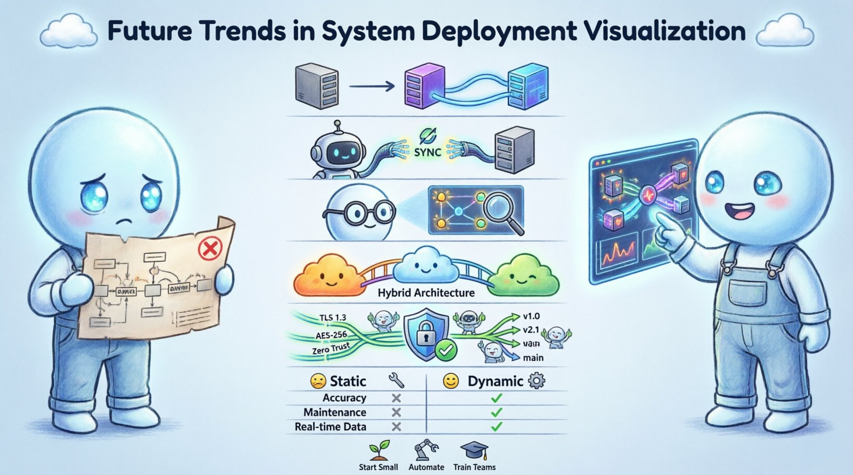
For decades, the standard approach to documenting system architecture involved creating static images. These diagrams were typically generated using drawing tools and then saved as files. While useful for high-level planning, they suffered from a critical limitation: they became outdated immediately upon creation. In modern environments, infrastructure changes frequently. Servers are spun up, services are scaled, and network routes are altered automatically.
The future of deployment visualization lies in bridging the gap between design time and runtime. Teams are moving toward models that synchronize with the actual state of the infrastructure. This shift reduces the cognitive friction between the documented architecture and the deployed reality. When a diagram matches the live environment, troubleshooting becomes significantly faster. Engineers no longer need to guess where a service resides or how it connects to a database.
Key drivers for this transition include:
- Automation: Infrastructure is provisioned via code, requiring documentation that updates automatically.
- Velocity: Deployment cycles are shorter, making manual diagram updates a bottleneck.
- Complexity: Microservice architectures introduce hundreds of interdependent components.
- Visibility: Stakeholders require immediate insights into system health and topology.
🔄 Real-Time Data Binding and API Integration
Static diagrams are being replaced by data-driven visualizations. This approach involves connecting the visual representation directly to the infrastructure’s management interfaces. Instead of drawing a box to represent a server, the visualization engine queries the infrastructure API to determine the existence and status of that server. If the server is decommissioned, the visual element disappears automatically.
This method ensures that the diagram is always a source of truth. It eliminates the maintenance burden associated with keeping documentation in sync with production. The following capabilities are central to this trend:
- State Synchronization: The visual model updates as soon as the underlying state changes.
- Health Indicators: Components display color-coded status based on operational metrics like latency or error rates.
- Dependency Mapping: Connections are drawn dynamically based on active network traffic or service registry data.
- Version Tagging: Visualizations can be filtered to show specific deployment versions or environments.
Implementing real-time binding requires a robust data pipeline. The visualization layer must consume streaming data from monitoring systems. This allows for the display of transient events, such as a container restarting or a load balancer shifting traffic. The result is a dashboard that functions more like a control panel than a schematic.
🤖 Artificial Intelligence in Topology Analysis
Artificial intelligence and machine learning are beginning to play a role in how deployment diagrams are interpreted. As systems become too large for humans to map manually, algorithms assist in identifying patterns and anomalies. AI-driven visualization does not just show what exists; it highlights what is unusual.
For example, an AI system might analyze historical deployment data and visualize potential bottlenecks before they cause incidents. It can suggest optimal placement for services based on network latency and resource availability. This predictive capability transforms the diagram from a record of the past into a tool for future planning.
Specific applications of AI in this domain include:
- Anomaly Detection: Highlighting connections that deviate from standard traffic patterns.
- Resource Optimization: Visualizing underutilized components that could be consolidated.
- Impact Analysis: Simulating the visual effect of removing a node to assess system resilience.
- Auto-Layout: Automatically arranging complex node graphs to reduce visual clutter and improve readability.
These capabilities reduce the time engineers spend on manual analysis. By surfacing hidden risks, the visualization acts as an early warning system. The diagram becomes an active participant in the incident response workflow.
☁️ Cloud-Native and Hybrid Architecture Mapping
The shift to cloud-native technologies has fundamentally altered the deployment landscape. Traditional monolithic applications are being replaced by distributed systems running across multiple environments. Hybrid architectures, which combine on-premises infrastructure with public cloud resources, add another layer of complexity. Visualizing these mixed environments requires a unified view that abstracts away the underlying hardware.
Deployment diagrams must now represent logical boundaries rather than physical servers. A single visual node might represent a cluster of containers distributed across different data centers. The visualization needs to handle logical grouping, such as namespaces or resource groups, without confusing the viewer with physical details.
Challenges in this area include:
- Network Abstraction: Showing how traffic flows between private and public networks securely.
- Service Mesh Integration: Representing the sidecar proxies and control planes that manage service communication.
- Multi-Cloud Consistency: Ensuring the visual style remains consistent regardless of the cloud provider used.
- Serverless Representations: Depicting event-driven functions that do not have a persistent running state.
Effective visualization in this context relies on logical grouping. Engineers should be able to toggle between a high-level view of the system and a granular view of the container runtime. This flexibility allows architects to communicate with both executive leadership and technical operations teams.
🔒 Security and Compliance Visualization
Security is no longer an afterthought in system design; it is a primary constraint. Deployment diagrams must now explicitly communicate security boundaries. This includes showing where encryption is applied, how authentication is managed, and where data flows cross trust zones. Regulatory compliance often requires proof of these boundaries, making visualization a legal necessity in some industries.
Visualizing security effectively involves highlighting specific attributes of the infrastructure. Trust boundaries should be clearly marked with distinct visual cues. Data classification levels can be overlaid on the diagram to show where sensitive information resides. This approach helps identify potential vulnerabilities where data might be exposed.
Key elements for security visualization include:
- Zero Trust Mapping: Showing every access point and verifying every connection.
- Encryption Zones: Highlighting segments where data is encrypted in transit or at rest.
- Compliance Tags: Labeling components that adhere to specific standards like HIPAA or GDPR.
- Audit Trails: Linking visual elements to logs that show who accessed the component and when.
When security is visible in the architecture, it becomes easier to enforce policies. Engineers can spot missing firewalls or unencrypted channels before code is deployed. This proactive approach reduces the risk of breaches and simplifies audit processes.
👥 Collaboration and Version Control Strategies
Diagram management is shifting toward the same version control principles used for code. In the past, diagrams were often stored as static files in shared drives, leading to version conflicts and lost updates. Modern approaches treat the diagram as a living artifact that lives in a repository.
This strategy allows teams to review changes, revert to previous states, and track the history of architectural decisions. It encourages collaboration by allowing multiple stakeholders to contribute to the model without overwriting each other. Pull requests for architectural changes ensure that modifications are reviewed by peers.
Benefits of version-controlled diagrams include:
- Auditability: A clear history of why and how the architecture changed over time.
- Conflict Resolution: Merging tools prevent simultaneous edits from destroying the model.
- Review Workflows: Formal approval processes for significant structural changes.
- Integration: Linking diagram changes to ticketing systems or deployment pipelines.
This culture of documentation-as-code ensures that the visual representation evolves alongside the software. It prevents the common scenario where the code and the documentation diverge significantly.
📊 Comparison of Visualization Approaches
| Feature | Static Diagrams | Dynamic Visualization |
|---|---|---|
| Accuracy | Low (requires manual updates) | High (syncs with live state) |
| Maintenance Cost | High (manual effort) | Low (automated) |
| Real-Time Data | None | Yes (latency, health, traffic) |
| Integration | Manual | API-driven |
| Best Use Case | High-level planning | Operations and troubleshooting |
| Version Control | File-based | Code-based |
⚠️ Challenges in Adoption
While the benefits of dynamic visualization are clear, adoption is not without hurdles. Organizations must navigate technical and cultural barriers to implement these systems effectively. One major challenge is the availability of data. Not all infrastructure exposes the necessary APIs for real-time visualization. Legacy systems may require custom integration work to feed data into the visualization layer.
Performance is another concern. Rendering a complex, live-updating diagram can be resource-intensive. If the visualization engine lags, it becomes less useful than a static image. Teams must balance detail with performance to ensure the tool remains responsive during high-traffic periods.
Additional challenges include:
- Data Privacy: Ensuring that sensitive infrastructure data is not exposed in the visualization.
- Standardization: Lack of universal standards for representing deployment logic visually.
- Skill Gaps: Engineers need new skills to manage and interpret dynamic models.
- Cost: Building custom visualization pipelines can require significant investment.
Addressing these challenges requires a phased approach. Organizations should start with critical subsystems before expanding to the entire architecture. Pilot programs can help identify integration points and performance bottlenecks early.
🛠️ Best Practices for Implementation
To successfully integrate future visualization trends, teams should follow established best practices. These guidelines help ensure that the investment in visualization yields tangible value. The focus should remain on clarity and utility rather than aesthetic complexity.
Core practices include:
- Start Small: Begin with a single service or environment to validate the workflow.
- Define Standards: Establish naming conventions and visual styles for consistency.
- Automate Updates: Ensure that changes in infrastructure trigger diagram updates automatically.
- Limit Detail: Show only the information relevant to the current user role.
- Train Teams: Provide training on how to interpret dynamic indicators and alerts.
By adhering to these practices, teams can avoid common pitfalls such as information overload or inconsistent data. The visualization should serve the team, not the other way around. Regular reviews of the diagram utility ensure it remains relevant as the system evolves.
🌐 The Path Forward
The landscape of system deployment visualization is shifting from static documentation to dynamic intelligence. This transition supports the increasing complexity of modern software systems. By adopting data-driven models, teams gain better visibility into their infrastructure. This visibility leads to faster troubleshooting, improved security, and more reliable deployments.
The future will likely see deeper integration between visualization and operational tools. Diagrams will not just show the system; they will allow engineers to interact with it directly. Clicking a node might trigger a scaling event or open a terminal session. This convergence of design and operations blurs the line between documentation and control.
Staying ahead of these trends requires continuous learning. Engineers must understand not only how to build systems but also how to represent them accurately. As the industry moves forward, the ability to visualize deployment architecture effectively will become a core competency for technical leadership.

