


In the landscape of software architecture, few artifacts are as misunderstood as the Deployment Diagram. Often relegated to the dustbin of legacy documentation or dismissed as mere network topology maps, these diagrams hold significant power when understood correctly. They serve as the bridge between abstract code and physical infrastructure. This guide aims to clarify the misconceptions surrounding them, providing a clear path for accurate system modeling.
🧐 Understanding the Core Purpose
A Deployment Diagram represents the physical or virtual hardware on which a software system runs. It visualizes the runtime architecture. Many professionals confuse this with a logical architecture or a network diagram. It is crucial to distinguish the deployment view from other modeling perspectives.
- Logical View: Focuses on components and their relationships.
- Deployment View: Focuses on nodes, artifacts, and communication paths.
- Network View: Focuses on IP addresses, subnets, and firewalls.
While these views overlap, the Deployment Diagram specifically addresses the execution environment. It answers the question: “Where does this code live, and how does it talk to other services?”.
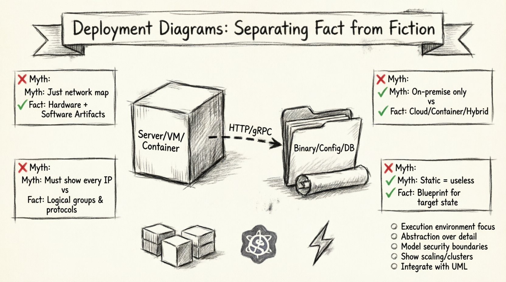
🚫 The Common Myths
There are several persistent beliefs about deployment diagrams that hinder effective architecture design. Let us examine the most prevalent ones and contrast them with technical reality.
Myth 1: It is Just a Network Topology Map 🌐
The Fiction: Many assume this diagram is simply a map of servers, routers, and cables.
The Fact: While it includes hardware nodes, the primary focus is on the software artifacts deployed onto those nodes. A node without an artifact is a shell. The diagram must show what software is running on the infrastructure.
- Node: Represents a computational resource (e.g., a server, container, or device).
- Artifact: Represents the physical implementation of a software component (e.g., a binary file, script, or library).
- Association: Shows how artifacts are deployed to nodes.
Myth 2: Only Relevant for On-Premise Systems 🖥️
The Fiction: Cloud computing has made static diagrams obsolete because infrastructure is ephemeral.
The Fact: Cloud environments are still environments. Whether physical or virtualized, every deployment requires a definition of where processes execute. Modern cloud architectures often rely on complex orchestration, making the deployment view even more critical for understanding scaling policies and dependency chains.
Myth 3: They Must Be Perfectly Detailed ⚙️
The Fiction: A good diagram must show every single IP address and port configuration.
The Fact: Diagrams are abstractions. Over-detailing creates maintenance nightmares. The goal is communication, not specification of every configuration parameter. High-level deployment diagrams focus on logical nodes (e.g., “Web Server Cluster”) rather than specific hardware specs.
Myth 4: Static Diagrams Cannot Represent Dynamic Systems 🔄
The Fiction: Because systems scale and move, a static drawing is useless.
The Fact: Deployment diagrams represent the target state or the baseline configuration. They describe the intended architecture. Dynamic changes are handled through operational runbooks, but the architecture blueprint remains valid.
📊 Fact vs. Fiction: A Detailed Comparison
| Aspect | Common Myth (Fiction) | Technical Reality (Fact) |
|---|---|---|
| Scope | Network topology only | Hardware + Software Artifacts |
| Environment | Physical servers only | Virtual, Container, Cloud, or Hybrid |
| Detail Level | Every IP address and Port | Logical Groups and Protocols |
| Utility | Static documentation | Blueprint for Deployment & Scaling |
| Tools | Manual drawing only | Integrated Model-Driven Tools |
🏗️ Anatomy of a Deployment Diagram
To construct a meaningful diagram, one must understand the standard elements used to represent the system. These elements adhere to established modeling standards.
1. Nodes 📦
A node is a physical or virtual computational resource. In a modern context, this might be:
- A physical server in a data center.
- A virtual machine instance.
- A container runtime environment.
- A mobile device or IoT sensor.
Nodes are often grouped to represent clusters or regions. For example, a “Web Tier” node group might contain multiple identical instances to handle load balancing.
2. Artifacts 📄
An artifact is a physical piece of information used or produced by a software development process. In the deployment context, it is the deliverable that runs on a node.
- Executables: Compiled binaries or scripts.
- Libraries: Shared code dependencies.
- Configuration Files: Settings that define behavior.
- Databases: Stored data schemas.
Artifacts are deployed to nodes using deployment relationships. This clarifies which software runs on which hardware.
3. Communication Paths 📡
Nodes do not exist in isolation. They communicate via protocols. The diagram must show how data flows between components.
- Network Protocols: HTTP, TCP/IP, gRPC.
- Middleware: Message queues or API gateways.
- Security Layers: Firewalls or encryption endpoints.
Labeling these paths with the protocol used is essential for understanding latency and security requirements.
☁️ Deployment in the Cloud Era
The shift toward cloud-native architectures has introduced new complexities. The traditional model of “one server, one app” has evolved into microservices, containers, and serverless functions.
Containerization Implications
When using container runtimes, the deployment diagram changes slightly. The artifact is no longer just a binary; it is a container image. The node might be a host machine running a cluster manager.
- Pod/Container: The smallest deployable unit.
- Orchestrator: Manages the lifecycle of containers.
- Service Mesh: Handles inter-service communication.
It is vital to represent the abstraction layer correctly. Showing a container image deployed to a node is more accurate than showing a generic server running a script.
Serverless Architectures
In serverless models, the concept of a node becomes abstracted away by the platform. The diagram focuses on the functions and the triggers that invoke them.
- Function: The code unit.
- Trigger: The event source (e.g., HTTP request, database change).
- Storage: Where data persists.
Even without visible nodes, the deployment diagram remains valid by focusing on the logical execution points.
🛠️ Best Practices for Construction
Creating effective diagrams requires discipline. Following established guidelines ensures the artifact remains useful over time.
1. Define the Audience 👥
Who will read this diagram? A DevOps engineer needs different details than a Project Manager.
- For Developers: Focus on component dependencies and deployment paths.
- For Operations: Focus on nodes, load balancers, and monitoring points.
- For Stakeholders: Focus on high-level tiers and cost centers.
2. Maintain Abstraction Levels 📏
Do not mix high-level and low-level details in the same view. If you are showing logical nodes, do not clutter the view with specific IP addresses. Use separate diagrams for different levels of granularity.
3. Version Control Your Models 📂
Just like code, architecture diagrams change. Treat them as versioned artifacts. Track changes to nodes and relationships over time to audit the evolution of the system.
4. Integrate with Other Diagrams 🔗
A deployment diagram should not stand alone. It connects to:
- Component Diagrams: Shows what is inside the nodes.
- Sequence Diagrams: Shows the runtime interaction flow.
- Class Diagrams: Shows the internal structure of the artifacts.
🚨 Common Pitfalls to Avoid
Even experienced architects make mistakes when modeling deployment. Recognizing these errors early prevents technical debt.
Pitfall 1: Ignoring Security Boundaries 🔒
Many diagrams show connections without indicating security zones. It is critical to distinguish between public-facing nodes and internal nodes.
- DMZ: Publicly accessible services.
- Internal Network: Trusted infrastructure.
- Private Network: Data storage and sensitive processing.
Pitfall 2: Overlooking Latency and Bandwidth ⏱️
If two nodes are in different regions, the communication path is not equal to a local link. Annotations regarding location and network constraints help developers understand performance implications.
Pitfall 3: Failing to Show Scaling 📈
A single node drawing implies a single point of failure. In production systems, critical nodes should be shown as clusters or groups to indicate redundancy and horizontal scaling capabilities.
Pitfall 4: Neglecting Non-Functional Requirements 📉
Deployment diagrams must account for non-functional needs like availability, reliability, and maintainability. These are often represented through specific node types or connection protocols.
🔍 Deep Dive: Artifact Deployment Relationships
The relationship between an artifact and a node is the core of the diagram. Understanding the cardinality of this relationship is key.
- 1-to-1: One artifact instance per node (e.g., a standalone service).
- 1-to-Many: One artifact type deployed across many nodes (e.g., a web application across a cluster).
- Many-to-1: Multiple artifacts on a single node (e.g., database and application server on one machine).
Clarity here prevents deployment confusion. If a team knows exactly which artifact goes to which node, automated deployment scripts become more reliable.
📝 Maintenance and Lifecycle
Diagrams rot. If they are not updated, they become misleading. A strategy for maintenance is essential.
- Trigger Updates: Update the diagram when the architecture changes significantly.
- Review Cycles: Include diagram review in the architecture decision record process.
- Tooling: Use tools that support code-based diagram generation where possible to keep them in sync with the infrastructure.
🌟 The Value of Accurate Modeling
When done correctly, the deployment diagram is a powerful tool. It facilitates communication between teams. It highlights bottlenecks before they occur. It serves as a blueprint for disaster recovery planning.
By separating fact from fiction, teams can leverage these diagrams to build more resilient systems. The effort invested in accurate modeling pays dividends during incidents and scaling events.
📌 Key Takeaways
- Deployment diagrams represent the execution environment, not just the network.
- They remain relevant in cloud and containerized environments.
- Abstraction is key; avoid unnecessary detail.
- Security boundaries and scaling must be explicitly modeled.
- Integration with other UML diagrams creates a complete picture.
Adopting a clear understanding of these principles elevates the quality of system design. It moves the conversation from guesswork to engineered precision.

