


In the landscape of modern software architecture, understanding how components interact across network boundaries is critical. A deployment diagram serves as the foundational blueprint for visualizing the physical and logical structure of a distributed system. It moves beyond code-level logic to answer questions about infrastructure, connectivity, and resource allocation. When engineers map out these diagrams, they create a shared language that bridges the gap between development, operations, and security teams.
This guide explores the mechanics of creating effective deployment diagrams for distributed environments. We examine the specific elements required to represent complex nodes, the protocols that bind them, and the strategies for maintaining clarity as systems scale. By focusing on accuracy and standardization, teams can reduce ambiguity and improve the reliability of their infrastructure.
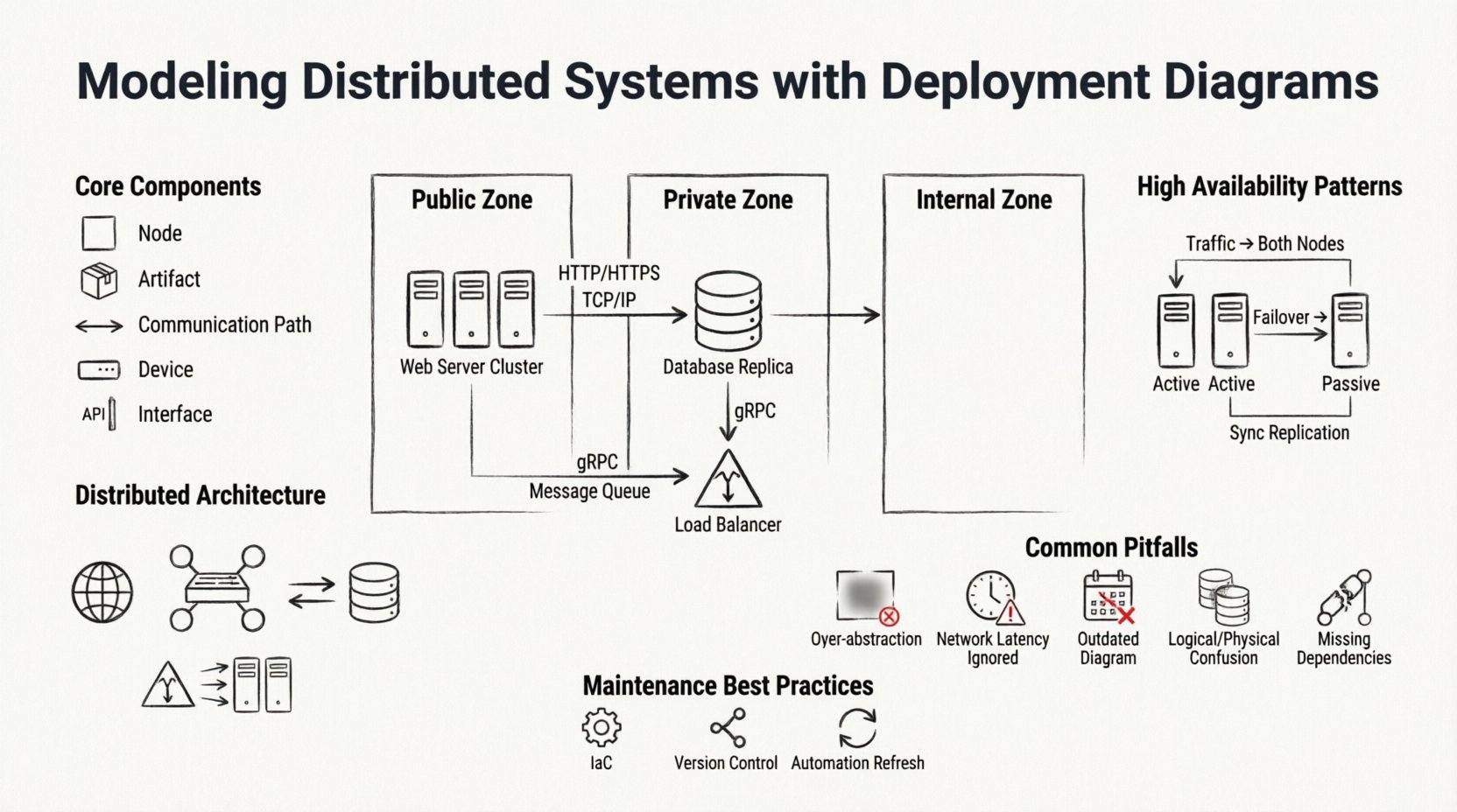
Understanding the Deployment Diagram 📐
A deployment diagram is a specialized type of diagram in the Unified Modeling Language (UML) that depicts the hardware and software architecture of a system. Unlike a class diagram, which focuses on data structures, or a sequence diagram, which focuses on interactions over time, the deployment diagram focuses on where things run. In a distributed context, this distinction is vital because the location of a component directly impacts performance, security, and fault tolerance.
When modeling distributed systems, the diagram must account for:
- Physical Boundaries: How data moves between different physical locations, such as data centers or regions.
- Logical Boundaries: How services are grouped regardless of physical location, often defined by network segmentation.
- Communication Paths: The protocols and channels used for data transmission between nodes.
- Resource Allocation: How compute, storage, and memory are distributed across the infrastructure.
Without a clear deployment view, teams often encounter issues during incident response. Knowing which node hosts a specific artifact or where a critical data flow traverses is essential for troubleshooting latency or connectivity failures.
Core Components of the Diagram 🧩
To build a robust diagram, one must understand the standard building blocks. These elements remain consistent regardless of the specific implementation details. The following table outlines the primary components and their roles in a distributed model.
| Component | Description | Example Usage |
|---|---|---|
| Node | A computational resource where artifacts are deployed. It can be physical or virtual. | A server instance, a container host, or a mobile device. |
| Artifact | The software component being deployed. It represents the executable or library. | A microservice binary, a database schema, or a configuration file. |
| Communication Path | A line connecting nodes that represents a network channel. | An HTTP connection, a TCP socket, or a message queue link. |
| Device | A physical hardware device with specific capabilities. | A router, a firewall, or a storage array. |
| Interface | A contract defining how an artifact interacts with others. | An API endpoint or a database schema interface. |
When defining these components, precision is key. A node labeled as a “Server” is less useful than one labeled as “Web Server Cluster” or “Database Replica.” Specificity helps operations teams identify the exact role of the infrastructure component during maintenance windows.
Representing Distributed Architecture 🌐
Distributed systems introduce complexity that centralized systems do not face. The deployment diagram must reflect this complexity without becoming cluttered. The primary challenge is balancing detail with readability. If every single microservice is drawn individually, the diagram becomes unreadable. If too much is abstracted, the diagram loses its utility.
To address this, architects often use hierarchical modeling. A high-level diagram shows the major zones (e.g., Public, Private, Internal). A lower-level diagram zooms into a specific zone to show the individual nodes and their interconnections. This approach allows stakeholders to view the system at the appropriate level of granularity.
Key considerations for distributed modeling include:
- Geographic Distribution: Clearly mark nodes that reside in different physical locations. This is crucial for understanding latency and compliance requirements.
- Network Topology: Indicate the type of network connecting the nodes. Is it a public internet connection, a private VLAN, or a dedicated fiber link?
- Replication: Show how data is copied across nodes. Use stereotypes or labels to indicate primary and replica nodes.
- Load Balancing: Represent load balancers as distinct nodes that direct traffic to backend pools.
By explicitly modeling these factors, teams can visualize bottlenecks before they occur. For instance, if all database replicas are shown on a single physical rack, the diagram reveals a single point of failure that might otherwise be overlooked.
Managing Connectivity and Protocols 🔌
Connectivity is the lifeblood of a distributed system. The deployment diagram must accurately represent how data flows between components. This involves specifying the protocols used for communication. While standard lines often suffice for high-level views, detailed diagrams should label the protocol.
Common protocols to model include:
- HTTP/HTTPS: Standard for web services and API gateways.
- TCP/IP: For persistent connections between backend services.
- Message Queues: Represented by specific nodes (e.g., RabbitMQ, Kafka) connecting producers and consumers asynchronously.
- gRPC: Often used for high-performance internal service-to-service communication.
It is important to distinguish between synchronous and asynchronous communication. Synchronous paths imply a direct request-response cycle, often requiring tight coupling. Asynchronous paths imply decoupling, where the sender does not wait for an immediate response. Modeling this distinction helps in designing resilient systems that can handle network partitions gracefully.
Security boundaries also play a role in connectivity. Firewalls and DMZs should be represented to show where traffic is inspected or restricted. This visualizes the security posture of the system and highlights potential risks where data might be exposed.
High Availability and Redundancy Patterns 🛡️
Reliability is a primary goal in distributed system design. Deployment diagrams are the tool used to validate high availability (HA) strategies. A robust diagram will show redundancy at multiple levels, ensuring that the failure of one component does not cascade into a total system outage.
Common patterns to model include:
Active-Active Clusters
Multiple nodes perform the same function simultaneously. Traffic is distributed among them. The diagram should show the load balancer feeding into the cluster and the shared storage or state management required.
Active-Passive Clusters
One node handles traffic while others remain on standby. The diagram must indicate the health check mechanism that triggers failover. This is often represented with a specific connector type or annotation.
Data Replication
Data consistency is vital. The diagram should illustrate how data is synchronized between nodes. Is it synchronous replication (blocking writes until confirmation) or asynchronous (fire-and-forget)? This distinction affects the system’s consistency model.
When modeling these patterns, avoid relying on implied knowledge. Explicitly draw the failover paths. If a node fails, where does the traffic go? Visualizing this path ensures that the design actually supports the intended reliability goals.
Common Modeling Pitfalls ⚠️
Even experienced architects make mistakes when creating deployment diagrams. Recognizing these pitfalls early can save significant time during implementation and troubleshooting.
- Over-Abstraction: Drawing a single box for “The Backend” hides the complexity of the internal architecture. It prevents teams from understanding specific resource requirements.
- Ignoring Network Latency: Treating a cloud region the same as a local network segment. This leads to unrealistic performance expectations.
- Static Snapshots: Creating a diagram that represents the system at one point in time but failing to update it as the system evolves. An outdated diagram is worse than no diagram at all.
- Confusing Logical with Physical: Mixing logical service names with physical hostnames. Keep the service logic separate from the physical deployment details.
- Missing External Dependencies: Failing to model third-party services or external APIs. These are often the source of the most unpredictable failures.
To avoid these issues, establish a standard for diagramming within the organization. Define what level of detail is required for different audiences. Developers might need more detail on API interfaces, while operations teams need more detail on hardware specs and network ports.
Maintaining Diagram Accuracy 🔄
A deployment diagram is a living document. As the system evolves, the diagram must evolve with it. In many organizations, diagrams are created during the design phase and then forgotten. This leads to a divergence between the documented architecture and the actual running system.
To maintain accuracy, consider the following strategies:
- Infrastructure as Code (IaC): Use IaC tools to generate diagrams automatically from the configuration files. This ensures the diagram always matches the infrastructure.
- Regular Reviews: Include diagram updates in the pull request process. If infrastructure changes, the diagram must change.
- Version Control: Store diagrams in the same repository as the code. This keeps them accessible alongside the implementation.
- Automation: Where possible, use monitoring tools to generate real-time topology maps that can supplement the static diagrams.
Maintaining the diagram is an investment in the team’s knowledge base. When a new engineer joins the team, the deployment diagram is often the first place they look to understand the system. A well-maintained diagram accelerates onboarding and reduces the risk of accidental outages caused by a lack of context.
Conclusion on Best Practices 📝
Effective modeling of distributed systems requires a balance of technical precision and clear communication. The deployment diagram is the bridge between abstract architecture and concrete infrastructure. By adhering to standard notations, focusing on critical connectivity, and maintaining accuracy over time, teams can build systems that are both robust and manageable.
Remember that the goal is not just to draw a picture, but to facilitate understanding. Every line, node, and label should serve a purpose in clarifying how the system operates in the real world. With a solid deployment model, teams can navigate the complexities of distributed computing with confidence and clarity.

