


System architecture documentation serves as the blueprint for engineering teams. Among the various modeling techniques available, the deployment diagram plays a critical role in visualizing the physical architecture of a software system. It maps the software artifacts onto the hardware nodes where they execute. However, creating these diagrams is often more complex than it appears. Many teams produce diagrams that are either misleading, outdated, or technically inaccurate.
When a deployment diagram fails to reflect reality, it creates friction during the development lifecycle. Onboarding new engineers becomes difficult, troubleshooting production issues slows down, and capacity planning becomes guesswork. This guide explores the most frequent errors encountered when constructing deployment diagrams. By understanding these pitfalls, you can ensure your architectural documentation remains a reliable asset.
🤔 What is a Deployment Diagram?
A deployment diagram illustrates the runtime configuration of a system. It shows the hardware devices, servers, networks, and middleware components involved. Unlike a class diagram that focuses on code structure, this diagram focuses on the environment. It connects the software components to the physical or virtual nodes that host them.
Key elements typically include:
- Nodes: Representing hardware or execution environments (e.g., servers, mainframes, mobile devices).
- Artifacts: Representing physical files like executables, libraries, or data files.
- Communication Paths: Showing how nodes connect (e.g., TCP/IP, HTTP, proprietary protocols).
- Dependencies: Indicating how one artifact relies on another across nodes.
Accuracy here is not just about aesthetics. It is about establishing a single source of truth for the infrastructure.
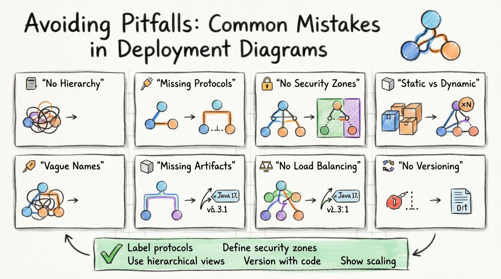
🚫 Mistake 1: Lack of Hierarchical Abstraction
One of the most common errors is attempting to show every single detail in a single view. When a system involves hundreds of nodes, a flat diagram becomes a tangled mess of lines that is impossible to read. This violates the principle of abstraction.
Why it happens: Architects often fear missing information. They try to capture the entire infrastructure topology in one image to satisfy stakeholders.
The Consequence: The diagram becomes unreadable. It loses its purpose as a communication tool. Engineers cannot quickly locate a specific server or understand the relationship between services.
The Solution: Use multiple views. Create a high-level overview diagram that shows major clusters or regions. Then, create detailed sub-diagrams for specific clusters. This allows you to drill down only when necessary.
- Level 1: Global topology (Regions, Availability Zones).
- Level 2: Cluster composition (Web tier, Database tier).
- Level 3: Specific node configuration (OS version, container type).
By organizing information hierarchically, you maintain clarity without sacrificing detail.
🚫 Mistake 2: Ignoring Communication Protocols
Connecting two nodes with a simple line implies communication, but it does not specify how. In complex systems, the protocol determines performance, security, and reliability. A line labeled “Connection” is insufficient.
Why it happens: It is easy to draw a line. Adding protocol labels requires technical verification.
The Consequence: Developers might assume a synchronous request when the system actually uses an asynchronous queue. This leads to incorrect implementation of error handling and timeout logic.
The Solution: Label all associations with the specific protocol or pattern.
- REST/HTTP: Standard web requests.
- gRPC: High-performance remote calls.
- Message Queue: Asynchronous messaging (e.g., pub/sub).
- Database Query: Direct SQL or NoSQL access.
Explicitly stating the protocol prevents misinterpretation during the coding phase. It ensures that the implementation matches the architectural intent.
🚫 Mistake 3: Overlooking Security Boundaries
Infrastructure diagrams often treat all nodes as equals. They rarely distinguish between public-facing services and internal, restricted systems. This omission hides critical security architecture.
Why it happens: Security concerns are sometimes treated separately from functional architecture.
The Consequence: Auditors and security engineers cannot easily identify exposure points. It becomes difficult to verify that sensitive data does not traverse public networks.
The Solution: Use distinct visual cues for security zones. Group nodes into zones representing trust levels.
- Public Zone: Internet-facing load balancers and gateways.
- DMZ: Semi-trusted services that mediate traffic.
- Internal Zone: Core business logic and databases.
- Restricted Zone: Secrets management and key storage.
Visualizing these boundaries helps identify where encryption is mandatory. It also clarifies which services require authentication to access.
🚫 Mistake 4: Confusing Static and Dynamic States
Deployment diagrams are often static representations of a dynamic environment. They show a snapshot in time. However, systems change constantly. A diagram that shows a single server might imply a single instance, whereas the actual system runs in a cluster.
Why it happens: Diagrams are created once and forgotten until the next major release.
The Consequence: The team believes the system is smaller than it is. Capacity planning fails because the diagram does not reflect scaling factors.
The Solution: Use notation to indicate multiplicity. If a node represents a cluster, indicate that it consists of multiple instances. Use annotations to specify scaling policies.
| Visual Element | Meaning | Example Context |
|---|---|---|
| Single Node Box | One instance | Legacy database server |
| Node with «Instance» label | Multiple copies | Web server cluster |
| Dashed Border | Virtualized environment | Container runtime |
| Cloud Icon | External/Managed Service | Cloud object storage |
By clearly marking instances and virtualization, you provide a more accurate picture of resource requirements.
🚫 Mistake 5: Ambiguous Node Naming
Nodes are often named generically, such as “Server 1” or “DB Node.” In a production environment, naming conventions are strict. A diagram that uses informal names does not map to the actual infrastructure.
Why it happens: Diagramming tools often allow free-text entry. Architects do not enforce naming standards.
The Consequence: DevOps engineers cannot automate deployments based on the diagram. They must manually look up what “Server 1” actually corresponds to in the configuration management system.
The Solution: Adopt a strict naming convention for nodes in the diagram. Use identifiers that match the infrastructure-as-code templates.
- Environment Prefix: prod-, dev-, staging-
- Function Suffix: -api, -web, -worker
- Region Code: -us-east, -eu-west
Example: prod-api-us-east-01. This name provides immediate context about the environment, role, and location.
🚫 Mistake 6: Missing Dependencies and Artifacts
It is common to show the nodes and connections but forget to list the artifacts residing on them. What version of the runtime is installed? What database schema is loaded? What configuration files are present?
Why it happens: Focusing on topology over content. Artifacts are seen as secondary details.
The Consequence: Reproducing the environment fails. A developer sets up the hardware correctly but uses the wrong version of the library, leading to runtime errors.
The Solution: Include artifact nodes within the hardware nodes. Show the version numbers explicitly.
- Runtime Version: Java 17, Python 3.9
- Middleware: Nginx 2.0, Redis 6.0
- Application Package: build-20231001.tar.gz
This level of detail is crucial for disaster recovery. It tells you exactly what needs to be deployed to restore a node.
🚫 Mistake 7: Ignoring Scalability and Load Balancing
Diagrams often show a single point of entry or a single database. In modern systems, horizontal scaling is the norm. Omitting load balancers or auto-scaling groups gives a false impression of capacity.
Why it happens: Architects design for the minimum viable product (MVP) and forget to update the diagram for production scale.
The Consequence: The system is designed to handle low traffic. When traffic spikes, the lack of redundancy causes outages because the diagram did not guide the infrastructure setup.
The Solution: Always depict the entry point mechanism. Show load balancers distributing traffic to a pool of nodes. Indicate if a database is replicated.
- Load Balancer: Essential for distributing requests.
- Replication: Show master-slave relationships for databases.
- Cache Layer: Show where caching occurs to reduce load.
Visualizing the flow of traffic helps identify bottlenecks before they occur in production.
🚫 Mistake 8: Neglecting Maintenance and Versioning
Diagrams have a half-life. They become obsolete quickly as the system evolves. Teams often fail to version their diagrams alongside their code.
Why it happens: Diagrams are treated as static deliverables rather than living documents.
The Consequence: The diagram no longer matches the code. This leads to confusion during incident response. Engineers follow the old diagram and deploy to the wrong nodes.
The Solution: Treat diagrams as code. Store them in the same repository as the application. Tag them with version numbers or commit hashes.
- Version Control: Use Git for diagram files.
- Release Notes: Update the diagram with every release.
- Audit Trail: Keep history of changes for compliance.
This ensures that the documentation is always traceable to the deployed version of the software.
✅ Best Practices Checklist
To ensure your deployment diagrams remain effective, use the following checklist during the review process.
- ☑️ Are all nodes clearly named and consistent with infrastructure code?
- ☑️ Are communication protocols labeled on all connections?
- ☑️ Do security zones (Public, Internal, Restricted) clearly defined?
- ☑️ Is the version of all software artifacts specified?
- ☑️ Does the diagram reflect the current production state?
- ☑️ Are scaling mechanisms (Load Balancers, Clusters) visible?
- ☑️ Is the diagram versioned alongside the application code?
- ☑️ Are dependencies between artifacts clearly marked?
- ☑️ Is the hierarchy logical (Overview vs. Detail)?
- ☑️ Are external dependencies (Third-party APIs) noted?
🔍 The Impact on Troubleshooting
When a system goes down, the deployment diagram is often the first resource engineers check. If the diagram is accurate, troubleshooting is faster. If it is wrong, time is wasted tracing connections that do not exist.
Scenario A: Accurate Diagram
- Engineer checks diagram.
- Identifies the correct database node.
- Verifies the connection protocol (PostgreSQL over SSL).
- Logs show the issue immediately.
Scenario B: Inaccurate Diagram
- Engineer checks diagram.
- Assumes direct connection to primary node.
- Realizes there is a hidden proxy layer.
- Waits for proxy configuration documentation.
- Downtime increases.
This highlights that the cost of a bad diagram is measured in lost time during critical incidents.
🔍 The Impact on Onboarding
New engineers join a team and need to understand the system. A deployment diagram is a visual map of the terrain. If the map is missing roads or shows rivers where there are only roads, the new hire will get lost.
Key Information Needed:
- Where is the code deployed?
- How do services talk to each other?
- Where are the secrets stored?
- What are the external dependencies?
A well-constructed diagram answers these questions immediately. It reduces the cognitive load on the new engineer. It allows them to start contributing faster.
🛠 Tools and Automation
While manual drawing is possible, it is prone to error. Modern practices suggest generating diagrams from infrastructure code. This ensures the diagram is always in sync with the actual environment.
Benefits of Automation:
- Consistency: The diagram is generated from the source of truth.
- Updates: Diagrams update automatically when infrastructure changes.
- Validation: Scripts can check for missing connections or security gaps.
Even if you use manual tools, consider integrating diagram maintenance into your CI/CD pipeline. Require that the diagram is reviewed and updated before a deployment is approved.
📝 Final Considerations
Creating accurate deployment diagrams requires discipline. It is not enough to draw lines between boxes. You must understand the underlying infrastructure, the protocols, and the security requirements. By avoiding the common pitfalls discussed in this guide, you ensure that your documentation serves its purpose.
Remember that a diagram is a contract. It represents the agreement between the design team and the operations team. If the contract is vague, the result will be chaotic. If the contract is precise, the system will be stable.
Focus on clarity, accuracy, and maintenance. Keep your diagrams current. Use them as a tool for communication, not just a requirement for a project phase. When done correctly, a deployment diagram becomes an invaluable asset for the entire organization.
Start reviewing your current diagrams today. Look for the mistakes listed here. Correct them. The effort you put into this documentation will pay dividends in system reliability and team efficiency.

