


Understanding the physical architecture of a software system is crucial for successful delivery and maintenance. A deployment diagram provides a high-level view of the hardware and software infrastructure, illustrating how components are mapped to physical nodes. These visualizations are not merely drawings; they are blueprints for system stability, scalability, and security.
This guide explores the most frequently encountered patterns in deployment diagrams. By recognizing these structures, architects and developers can communicate system requirements more effectively and anticipate infrastructure challenges before they arise. We will examine the elements, the patterns, and the practical considerations for each.
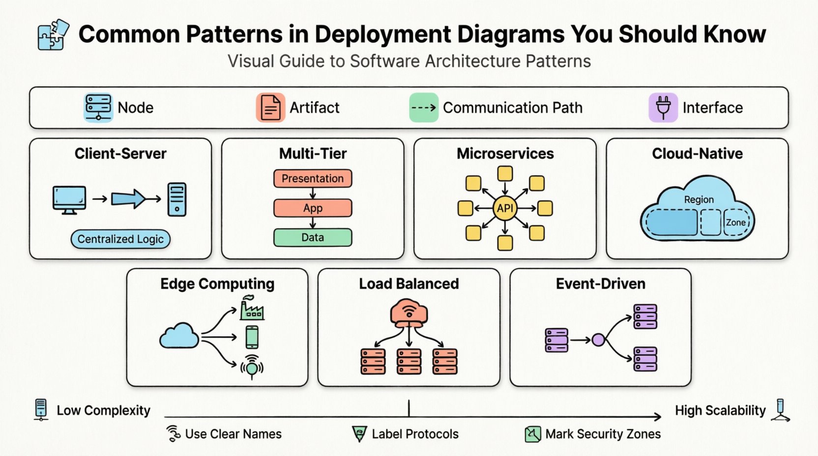
Core Components of a Deployment Diagram 🧩
Before diving into specific patterns, it is necessary to understand the building blocks used to construct these diagrams. A standard deployment view relies on a few key concepts:
- Node: A physical or virtual computing device. This can be a server, a mobile device, an IoT sensor, or a container instance. Nodes represent the execution environment.
- Artifact: A physical piece of information or code that is deployed to a node. Examples include executable files, database schemas, configuration files, and libraries.
- Communication Path: The connection between nodes. This defines how data travels, often representing networks like LAN, WAN, or the Internet.
- Interface: A point of interaction where a node exposes functionality to other nodes or artifacts.
When creating a diagram, the goal is to show where artifacts reside and how they interact. The level of detail depends on the audience. A high-level view might show just the cloud and the database, while a detailed view might show individual application servers and load balancers.
1. The Client-Server Pattern 🖥️
The client-server model is the foundation of most traditional computing systems. It separates the user interface and request logic (client) from the data processing and storage logic (server).
Diagram Structure
- Client Node: Represents the user’s device. This could be a desktop computer, a tablet, or a mobile phone. It hosts the user interface artifact.
- Server Node: A dedicated machine or cluster that processes requests. It hosts the application logic and connects to storage.
- Connection: Typically a network link labeled “HTTP” or “TCP/IP”.
Key Characteristics
- Centralized Logic: The business rules reside on the server.
- Stateless Clients: The client usually does not store significant data permanently.
- Scalability: Scaling often involves adding more server nodes behind a load balancer rather than upgrading the client.
This pattern is straightforward to visualize. It clearly shows the boundary between the user environment and the backend infrastructure. However, in modern contexts, this pattern often evolves into more complex structures as requirements grow.
2. The Multi-Tier (N-Tier) Pattern 🏢
As applications grew in complexity, the simple two-tier client-server model became a bottleneck. The multi-tier pattern introduces intermediate layers to separate concerns, typically dividing the system into Presentation, Application, and Data layers.
Diagram Structure
| Layer | Deployment Node | Primary Artifact |
|---|---|---|
| 1. Presentation | Web Server / Client Device | HTML, CSS, JavaScript |
| 2. Application | Application Server | Compiled Code, Business Logic |
| 3. Data | Database Server | Database Instance, Schema |
Key Characteristics
- Separation of Concerns: Each tier can be developed, tested, and scaled independently.
- Security: The database layer is often isolated from the public internet, accessible only via the application layer.
- Maintainability: Changes in the user interface do not necessarily impact the data layer.
When diagramming this, it is important to show the communication flow. The client talks to the web server, the web server talks to the application server, and the application server talks to the database. Using distinct nodes for each tier makes this separation visually clear.
3. The Microservices Pattern 🧱
Microservices architecture breaks a large application into small, independent services. Each service runs in its own process and communicates via lightweight mechanisms. In a deployment diagram, this looks very different from the monolithic multi-tier model.
Diagram Structure
- Service Nodes: Multiple nodes, each hosting a specific microservice. These are often containers running on a shared orchestration platform.
- API Gateway: A single entry point node that routes requests to the appropriate service.
- Service Mesh: Optional infrastructure nodes that handle service-to-service communication, security, and observability.
Key Characteristics
- Independent Deployment: One service can be updated without deploying the entire system.
- Technology Diversity: Different services can use different runtime environments or databases.
- Resilience: Failure in one service does not necessarily bring down the whole system.
Visualizing microservices requires careful management of lines. Too many connections create a “spaghetti diagram.” Grouping services by domain (e.g., “Order Service,” “User Service”) helps clarify the architecture. It is also common to show a shared infrastructure layer, such as a message queue or a centralized logging service, supporting all the nodes.
4. Cloud-Native & Distributed Patterns ☁️
Modern systems often rely on public cloud infrastructure. These diagrams differ from on-premise diagrams because the physical hardware is abstracted away. The focus shifts to logical regions, availability zones, and managed services.
Diagram Structure
- Region Nodes: Large geographic areas where infrastructure is deployed.
- Availability Zone: Distinct data centers within a region, often shown as sub-nodes.
- Managed Services: Artifacts representing services like storage buckets, queue brokers, or serverless functions.
Key Characteristics
- Elasticity: Nodes can scale up or down automatically based on demand.
- Redundancy: Critical components are replicated across availability zones to ensure uptime.
- Cost Management: The diagram reflects the cost structure of cloud resources (e.g., pay-per-use vs. reserved instances).
When drawing these diagrams, it is helpful to group nodes by region. For example, showing a primary region and a disaster recovery region side-by-side. This highlights the failover strategy. It is also important to indicate which connections traverse the public internet and which stay within the private cloud network.
5. Edge Computing Patterns 🌍
Edge computing moves computation closer to the source of data. This is common in IoT, gaming, and real-time analytics. The deployment diagram for this pattern extends beyond the central data center to include peripheral devices.
Diagram Structure
- Edge Nodes: Local servers or powerful devices located near the data source (e.g., a factory gateway, a base station).
- Central Cloud: The main backend for heavy processing and long-term storage.
- Sync Connection: A link between edge and cloud, often asynchronous.
Key Characteristics
- Low Latency: Processing happens locally to reduce response time.
- Bandwidth Efficiency: Only essential data is sent to the central cloud.
- Autonomy: Edge nodes can often function independently if the network connection is lost.
Diagramming edge computing requires showing the hierarchy. The central cloud is the root, with branches leading to regional edge nodes. This helps stakeholders understand where data is processed and where it is stored. Security considerations are also vital here, as edge nodes may be in less secure physical locations.
6. Load Balanced Cluster Patterns 🔄
High availability is a common requirement for enterprise systems. This pattern uses multiple identical nodes to share the workload and ensure that if one fails, others take over.
Diagram Structure
- Load Balancer Node: A dedicated node that distributes incoming traffic.
- Server Cluster: A group of identical application servers.
- Health Checks: A logical link showing the load balancer monitoring the status of server nodes.
Key Characteristics
- High Availability: The system remains operational during maintenance or hardware failure.
- Performance: Traffic is distributed to prevent any single node from becoming a bottleneck.
- State Management: Requires care in how session data is handled (e.g., sticky sessions or shared state).
When representing this, it is common to draw a box around the cluster nodes to indicate they function as a single logical unit. The load balancer sits outside this box, acting as the entry point. This clearly communicates the redundancy strategy to the operations team.
7. Event-Driven Architecture Patterns ⚡
In event-driven systems, components react to events rather than waiting for direct requests. This decouples the producer of data from the consumer. The deployment diagram reflects this asynchronous communication.
Diagram Structure
- Producer Nodes: Services that generate events.
- Consumer Nodes: Services that listen for and process events.
- Message Broker: A central node responsible for routing messages between producers and consumers.
Key Characteristics
- Decoupling: Producers do not need to know which consumers exist.
- Scalability: Consumers can be scaled independently based on the message queue depth.
- Reliability: Messages are often persisted in the broker to prevent data loss.
Visualizing this pattern involves showing the message broker as a hub. Lines flow from producers to the broker, and from the broker to consumers. Labeling these paths with specific protocols (like “MQTT” or “AMQP”) adds clarity. It is also useful to note which consumers are active and which are dormant.
Comparison of Deployment Patterns 📊
To summarize the differences, the following table outlines the trade-offs associated with each pattern.
| Pattern | Complexity | Scalability | Best Use Case |
|---|---|---|---|
| Client-Server | Low | Moderate | Simple internal tools |
| Multi-Tier | Moderate | High | Enterprise web applications |
| Microservices | High | Very High | Large, evolving platforms |
| Cloud-Native | Moderate | Elastic | Public facing SaaS |
| Edge Computing | High | Variable | IoT and real-time processing |
| Load Balanced | Moderate | High | Critical uptime services |
| Event-Driven | High | High | Asynchronous workflows |
Best Practices for Diagramming 📝
Creating a deployment diagram is as much an art as it is a technical task. Following established guidelines ensures the diagram remains useful over time.
1. Maintain Abstraction Levels
A single diagram rarely captures every detail. Use different views for different audiences. The executive view might show regions and major services. The engineering view should show specific nodes, ports, and protocols. Do not mix these levels in one image.
2. Use Clear Naming Conventions
Nodes should have meaningful names. Avoid generic labels like “Node 1” or “Server A.” Instead, use “Web Server Cluster” or “Production Database.” Artifacts should also be named to reflect their function, such as “Payment Processing Module” rather than “App.jar”.
3. Define Communication Protocols
Label your connections. Knowing that a link is “HTTPS” provides more information than a generic line. This helps security teams identify potential vulnerabilities and network engineers plan bandwidth requirements.
4. Indicate Security Boundaries
Use dashed lines or shaded regions to show security zones. Clearly mark which parts of the system are exposed to the public internet and which are internal only. This is critical for compliance and risk assessment.
5. Keep it Updated
A deployment diagram that does not match reality is worse than no diagram at all. Integrate diagram updates into the deployment pipeline. Whenever infrastructure changes, the diagram should be reviewed and revised.
Common Mistakes to Avoid ⚠️
Even experienced architects can make errors when visualizing infrastructure. Being aware of these pitfalls helps maintain diagram quality.
- Over-Engineering: Including every single physical server in a cluster makes the diagram unreadable. Group them logically.
- Ignoring Latency: Showing a connection between two nodes in different continents without noting the latency implications can lead to performance issues.
- Missing Dependencies: Failing to show that a service depends on a specific database or configuration file can cause deployment failures.
- Static Representation: Cloud systems are dynamic. Avoid showing a static snapshot that implies fixed resource allocation.
- Confusing Logical and Physical: Ensure the diagram represents physical deployment, not just logical components. A logical component might exist on multiple physical nodes.
Mapping Diagrams to Infrastructure Reality 🌐
A deployment diagram is a model. It must eventually translate into actual infrastructure. This translation process involves several steps:
- Resource Sizing: Based on the nodes in the diagram, determine the CPU, memory, and storage requirements.
- Network Configuration: The communication paths dictate firewall rules, subnets, and routing tables.
- Automation: Modern infrastructure uses code to define the diagram. Tools allow you to define the nodes and connections in text files, which then provision the actual environment.
- Monitoring: The nodes in the diagram should correspond to the entities being monitored. If a node is not monitored, it is not visible to the operations team.
This alignment ensures that the design intent is preserved during implementation. If the diagram shows a load balancer, the provisioning script must create one. If the diagram shows a database replica, the infrastructure must support it.
Conclusion 🏁
Deployment diagrams are essential tools for communicating the physical structure of software systems. By understanding the common patterns—from simple client-server models to complex microservices and edge computing setups—teams can design more robust and maintainable architectures.
The key to success lies in clarity. A good diagram answers questions before they are asked. It shows where data lives, how it moves, and what happens when things go wrong. By adhering to best practices and avoiding common pitfalls, architects can create diagrams that serve as reliable guides for the entire lifecycle of a system.
Whether you are planning a new infrastructure or documenting an existing one, applying these patterns ensures that the visual representation matches the technical reality. This alignment is the foundation of reliable software delivery.

