


In modern software architecture, visualizing how applications interact with underlying hardware and infrastructure is critical. A deployment diagram serves as a map for the physical reality of your system. It moves beyond logical code structures to show where components actually run. This guide explores the mechanics of constructing these diagrams without relying on specific tools or products. The focus remains on principles, clarity, and architectural integrity.
🔍 Understanding the Core Elements of a Deployment Diagram
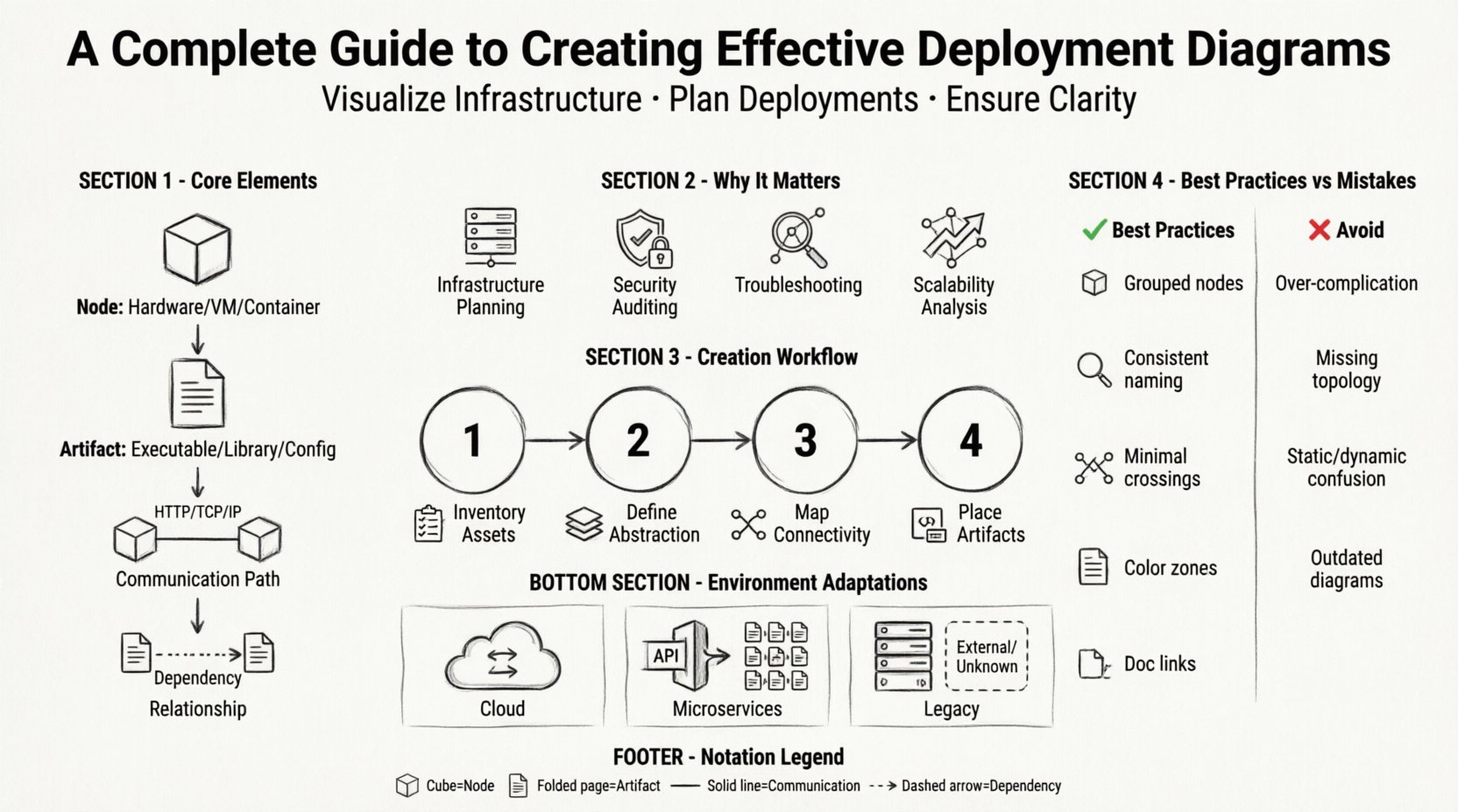
Before drawing lines and boxes, it is necessary to understand the building blocks. These diagrams represent the static physical view of a system. They illustrate the topology of the hardware and the software that resides upon it. The following components form the foundation of any deployment diagram:
- Nodes: These represent the computational resources where software runs. They can be physical devices like servers, routers, or workstations. They can also be abstract, such as virtual machines or containers.
- Artifacts: These are the physical pieces of software that are deployed onto the nodes. Examples include executable files, libraries, database schemas, or configuration scripts.
- Communication Paths: Lines connecting nodes indicate how they exchange data. These often specify protocols like HTTP, TCP/IP, or specialized message queues.
- Relationships: Arrows show dependencies. For instance, an application artifact might depend on a specific database artifact residing on another node.
Understanding the distinction between a Node and an Artifact is vital. A node is the environment; the artifact is the payload. Confusing the two leads to diagrams that are difficult to read or maintain.
📊 Why This Diagram Matters for Architecture
Deployment diagrams are not merely decorative. They serve functional purposes for development teams, operations staff, and stakeholders. Their value lies in clarity and communication.
- Infrastructure Planning: They help identify resource requirements. If a diagram shows three database nodes, the infrastructure team knows to provision three servers.
- Security Auditing: By mapping where sensitive data resides, teams can assess exposure. If a database node is directly connected to the internet without a firewall node, the risk is visible.
- Troubleshooting: When a system fails, the diagram provides a starting point. Engineers can trace the data path to see where the breakdown occurred.
- Scalability Analysis: Visualizing the layout allows architects to simulate scaling. Adding a load balancer node, for example, changes the traffic flow significantly.
🛠️ Step-by-Step Creation Process
Creating a deployment diagram is a structured activity. It requires gathering data, making decisions about abstraction, and refining the visual representation. Follow this workflow to ensure accuracy.
1. Inventory Existing Assets
Begin by listing all hardware and software components involved in the deployment. This includes:
- Web servers and application servers
- Database management systems
- Storage units and file systems
- Network devices (routers, firewalls, load balancers)
- Client devices (mobile, desktop, IoT)
2. Define Levels of Abstraction
Not every detail needs to be visible at once. A deployment diagram can exist at different levels of granularity:
- High-Level: Shows major systems and connections (e.g., Cloud, On-Premise, Third-Party API).
- Mid-Level: Breaks down the cloud into specific services or server clusters.
- Low-Level: Details specific IP addresses, ports, and individual container instances.
Choose the level based on the audience. Executives need high-level; engineers need low-level.
3. Map Connectivity
Draw the lines connecting the nodes. Be specific about the nature of the connection. Use standard notation for communication paths. Label the lines with protocol names to avoid ambiguity. For example, label a line between a client and server as HTTPS rather than just a line.
4. Place Artifacts
Place the software components inside the nodes. Use stacking notation if multiple artifacts reside on a single node. Ensure that dependencies are clear. If Artifact A calls Artifact B, the diagram should reflect the path this call takes across the network.
✨ Best Practices for Clarity and Maintainability
A diagram that is hard to read is useless. Adhering to best practices ensures the artifact remains useful over time.
- Group Related Nodes: Use containers or compartments to group nodes that belong to the same environment. For example, group all internal servers together and separate them from external gateways.
- Consistent Naming: Use a standard naming convention for all nodes and artifacts. Avoid names like Server1 or TestDB. Use descriptive names like WebServer-Prod-01 or CustomerDatabase.
- Limit Line Crossings: Arrange nodes to minimize crossing lines. This improves readability. If lines must cross, use routing patterns or break them slightly to indicate a junction.
- Color Coding: Use color to indicate status or environment, not just decoration. For instance, green for production, yellow for staging, and red for development. Use color sparingly to maintain accessibility.
- Documentation Links: If the diagram is complex, link to detailed documentation. The diagram should be a summary, not the entire manual.
⚠️ Common Mistakes to Avoid
Even experienced architects make errors. Being aware of common pitfalls helps prevent them.
| Mistake | Consequence | Solution |
|---|---|---|
| Over-complicating the view | Stakeholders cannot find the key information. | Use multiple diagrams for different levels of detail. |
| Ignoring network topology | Security risks and latency issues are hidden. | Include firewalls and routers in the path. |
| Static vs. Dynamic confusion | Readers assume behavior that does not exist. | Clarify if the diagram shows runtime state or static structure. |
| Outdated information | Teams deploy to wrong infrastructure. | Implement a review cycle for diagram updates. |
🔗 Integration with Other Models
A deployment diagram does not exist in isolation. It works in tandem with other diagrams to provide a complete picture of the system.
- Component Diagrams: While deployment shows the physical hardware, component diagrams show the logical software modules. The deployment diagram maps components to nodes.
- Sequence Diagrams: Sequence diagrams show the flow of data over time. Deployment diagrams show where that data travels physically. Combining them helps trace a request from client to database and back.
- Class Diagrams: Class diagrams define the data structures. Deployment diagrams define where the classes are instantiated in memory or stored on disk.
🔄 Maintenance and Lifecycle Management
Infrastructure changes frequently. Cloud migrations, server upgrades, and security patches alter the topology. A deployment diagram that is not maintained becomes a liability.
- Version Control: Treat diagrams like code. Store them in a repository. Tag versions with deployment releases.
- Change Triggers: Define when a diagram must be updated. Examples include adding a new region, changing a database engine, or modifying network security groups.
- Automated Checks: Where possible, use scripts to verify the diagram against the actual infrastructure. This reduces manual errors.
- Regular Reviews: Schedule quarterly reviews of the architectural diagrams with the DevOps and Engineering leads.
📐 Technical Considerations for Specific Environments
Different environments require different diagrammatic approaches. Understanding these nuances ensures the diagram remains accurate.
Cloud Environments
Cloud architecture is dynamic. Auto-scaling groups mean nodes are not static. In deployment diagrams for cloud systems, represent groups of nodes rather than individual instances. Use icons that represent service types (e.g., compute, storage, networking) rather than specific hardware models.
Microservices Architectures
Microservices introduce complexity due to the number of services. A deployment diagram for this style often becomes a mesh. Simplify by grouping services by function (e.g., User Service, Order Service) within a cluster node. Focus on the API Gateway as the entry point.
Legacy Systems
Legacy systems often have undocumented dependencies. When diagramming these, focus on the interfaces and connections rather than the internal logic. Acknowledge unknown dependencies by marking them clearly as External/Unknown.
📋 Summary of Key Symbols and Notation
Consistency in notation is essential for team alignment. While standards exist, teams often adopt their own conventions. The following list covers the standard symbols used in this context.
- Node Symbol: A 3D cube or rectangle with a label. Often has a folded corner to indicate a device.
- Artifact Symbol: A rectangle with a folded corner (page symbol). Represents a file or object.
- Communication Path: A solid line. Can be a simple line or a line with an arrowhead indicating direction.
- Association: A line connecting an artifact to a node. Indicates that the artifact is deployed to the node.
- Dependency: A dashed line with an arrow. Indicates that one artifact requires another to function.
🎯 Final Thoughts on Deployment Visualization
Effective deployment diagrams bridge the gap between code and reality. They allow teams to see the forest and the trees simultaneously. By focusing on accurate representation, clear notation, and regular maintenance, these diagrams become powerful tools for system stability. The goal is not to create a perfect image, but to create a useful map that guides decision-making and reduces risk.
When you update your infrastructure, update your diagram. When you add a new service, add a new node. Treat the diagram as a living document that reflects the current state of the system. This discipline ensures that the architecture remains transparent and manageable as the software evolves.
