


In the landscape of software architecture, clarity is paramount. When designing complex systems, visual models serve as the blueprint for developers, stakeholders, and operations teams. Two of the most critical diagrams in the Unified Modeling Language (UML) are the Deployment Diagram and the Component Diagram. While they both describe system structure, they operate at different abstraction levels and serve distinct purposes.
Understanding the nuance between these two is not merely an academic exercise. It dictates how infrastructure is provisioned, how code is organized, and how the system scales. This guide provides a deep dive into the distinctions, use cases, and architectural implications of each diagram type.
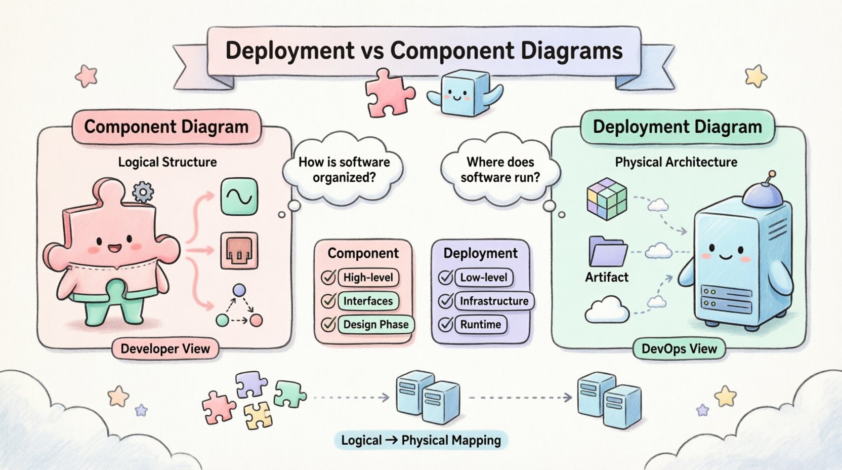
Understanding the Component Diagram 🧩
A Component Diagram focuses on the logical structure of a system. It describes the organization and relationships between components within the software architecture. Think of it as a map of the internal machinery, independent of where that machinery physically resides.
Core Characteristics
- Abstraction Level: High-level logical view.
- Focus: Functionality, interfaces, and dependencies.
- Building Blocks: Components, Interfaces, Ports, and Nodes.
- Context: Application logic and software design.
Components represent modular parts of a system. They encapsulate functionality and expose it through interfaces. This allows developers to swap out implementations without affecting the rest of the system, provided the interface remains consistent.
Key Elements
- Component: A modular, replaceable part of a system that encapsulates its contents. Examples include a library, a subsystem, or a class group.
- Interface: A set of operations provided by a component. This defines how other parts interact with it.
- Port: A designated interaction point on a component where connections are made.
- Dependency: A relationship indicating that one component requires another to function correctly.
Why Use a Component Diagram?
Architects use this diagram during the design phase to:
- Visualize the decomposition of the system into manageable modules.
- Define the contract between different parts of the software.
- Identify potential bottlenecks in data flow between logical units.
- Plan for maintainability and future refactoring.
It answers the question: “How is the software organized logically?”
Understanding the Deployment Diagram 🖥️
A Deployment Diagram focuses on the physical or hardware topology of the system. It depicts the runtime environment, the physical servers, the network infrastructure, and how software artifacts are deployed onto that infrastructure.
Core Characteristics
- Abstraction Level: Low-level physical view.
- Focus: Infrastructure, hardware, and runtime artifacts.
- Building Blocks: Nodes, Artifacts, and Communication Paths.
- Context: System operations, DevOps, and Infrastructure.
Nodes represent physical computing resources. They can be servers, routers, mobile devices, or even cloud instances. Artifacts represent the actual software files (executable code, database schemas, configuration files) running on these nodes.
Key Elements
- Node: A physical computing resource. This could be a physical server, a virtual machine, or a cloud container.
- Artifact: A physical representation of a software component. This includes executables, libraries, or data files.
- Communication Path: The network connection between nodes (e.g., TCP/IP, HTTP, Ethernet).
- Device: A resource with limited processing power, such as a mobile phone or an IoT sensor.
Why Use a Deployment Diagram?
Engineers and operations teams use this diagram to:
- Plan the infrastructure required to support the application.
- Visualize network topology and security zones.
- Understand load balancing and redundancy strategies.
- Document the deployment pipeline and environment configurations.
It answers the question: “Where does the software run?”
Side-by-Side Comparison 📊
To clarify the distinctions, we can examine the differences across several dimensions. This table highlights the specific focus and utility of each diagram type.
| Feature | Component Diagram 🧩 | Deployment Diagram 🖥️ |
|---|---|---|
| Primary Focus | Logical Structure | Physical Architecture |
| Viewpoint | Developer / Architect | DevOps / System Admin |
| Key Elements | Interfaces, Packages, Classes | Nodes, Servers, Network |
| Relationship | Dependencies, Associations | Communication, Mapping |
| Static vs Dynamic | Static Structure | Static Structure (Runtime) |
| Environment | Abstract / Implementation | Concrete / Infrastructure |
| Change Frequency | Low (Design Phase) | High (Ops & Scale) |
Deep Dive: Logical vs. Physical Mapping 🔄
One of the most confusing aspects for practitioners is how these two diagrams relate. They are not mutually exclusive; rather, they are complementary. The Component Diagram describes the what, while the Deployment Diagram describes the where.
The Mapping Process
In a mature architecture, there is a direct mapping between components and artifacts on nodes. A single component might be deployed across multiple nodes for redundancy. Conversely, multiple components might reside on a single node for consolidation.
- Many-to-One: Multiple microservices (components) running on a single Kubernetes pod (node).
- One-to-Many: A critical database service (component) replicated across three physical servers (nodes) for high availability.
- Many-to-Many: A complex enterprise system where components are distributed across multiple data centers.
This mapping is critical for understanding latency, fault tolerance, and resource consumption. A Component Diagram alone cannot reveal network bottlenecks. A Deployment Diagram alone cannot reveal logical coupling issues.
When to Use Which? 🤔
Choosing the right diagram depends on the stage of the project and the audience involved.
Use Component Diagrams When:
- Designing the System: During the initial architecture phase, you need to define modules.
- Defining APIs: You need to specify how services communicate via interfaces.
- Refactoring: You are planning to restructure code without changing the physical infrastructure.
- Onboarding New Developers: New team members need to understand the logical flow of data.
Use Deployment Diagrams When:
- Provisioning Infrastructure: You are setting up servers, containers, or cloud instances.
- Security Auditing: You need to visualize network boundaries and data flow between zones.
- Disaster Recovery Planning: You need to know how components failover across physical nodes.
- Performance Tuning: You need to identify where network hops occur between logical services.
Common Pitfalls and Misconceptions ⚠️
Even experienced architects make mistakes when modeling these diagrams. Being aware of common errors helps maintain accuracy.
1. Confusing Nodes with Components
A common error is drawing a component inside a node without distinguishing between the logical unit and the physical host. Remember: a component is code; a node is hardware (or a virtual representation of it). If you draw a component, it should represent a software module. If you draw a node, it represents a machine.
2. Over-Complicating the Deployment
Deployment diagrams can quickly become messy if every single server is drawn. Focus on representative nodes. If you have 50 identical web servers, draw one, label it as “Web Server Cluster”, and indicate the count.
3. Ignoring Network Latency
Component diagrams often assume instant communication. Deployment diagrams must account for network distance. A component on Node A communicating with a component on Node B is different from Node A communicating with Node A. The deployment diagram captures this physical reality.
4. Static vs. Runtime Confusion
Both diagrams are technically static representations. However, the Deployment Diagram represents the runtime state. It is crucial to ensure that the artifacts shown in the deployment diagram match the actual deployed versions. A deployment diagram that is not updated after a release is misleading.
Best Practices for Documentation 📝
To ensure these diagrams remain useful assets rather than outdated paperwork, follow these guidelines.
Keep Them Updated
Documentation that diverges from reality is worse than no documentation. Integrate diagram updates into the deployment pipeline. When a node is added or a component is refactored, the diagram should reflect that change.
Use Standard Notation
Adhere to UML standards. While tools vary, using standard shapes for nodes and components ensures that anyone in the organization can read the diagram. Avoid proprietary symbols that obscure meaning.
Focus on Critical Paths
Do not attempt to model every single dependency. Highlight the critical paths that impact performance or security. If a diagram is too dense, stakeholders will ignore it. Simplify by grouping related components.
Link to Source Code
Where possible, link the logical components in the diagram to the actual repositories. This creates a traceability path from the infrastructure view back to the code implementation.
Scalability and Architecture Evolution 📈
As systems grow, the relationship between component and deployment diagrams evolves. In monolithic architectures, the distinction is often blurred. In microservices architectures, the distinction becomes critical.
Monolithic Systems
In a monolith, a Component Diagram might show a single large block. The Deployment Diagram would show that block running on a single server or a cluster behind a load balancer. The mapping is straightforward.
Microservices Systems
In a distributed system, the Component Diagram shows dozens of services. The Deployment Diagram shows how these services are distributed across containers, orchestrators, and cloud regions. The complexity increases exponentially. The Deployment Diagram becomes the source of truth for the infrastructure.
Interdependency Management 🕸️
One of the most powerful aspects of modeling these diagrams is managing interdependencies. When a component changes, does it require a new server? Does it require a new network port? The diagrams help answer these questions.
- Component Change: If a database component changes schema, the Deployment Diagram helps identify which database servers need to be updated.
- Infrastructure Change: If a node is decommissioned, the Component Diagram helps identify which logical services will be affected.
This bidirectional analysis is essential for change management. It prevents “drift” where the code and the infrastructure become misaligned.
Security Implications 🔒
Security teams rely heavily on Deployment Diagrams. They need to see:
- Where sensitive data is stored.
- Which nodes are exposed to the public internet.
- How encryption is handled between nodes.
Component Diagrams help security teams understand:
- Which components handle authentication.
- Where data validation occurs.
- The data flow boundaries between trust zones.
Combining both views provides a comprehensive security posture analysis.
Conclusion on Selection 🏁
Selecting between a Deployment Diagram and a Component Diagram is not about choosing one over the other. It is about selecting the right lens for the current problem.
- Use the Component Diagram to design the logic, define interfaces, and ensure code maintainability.
- Use the Deployment Diagram to provision resources, plan for failure, and manage the infrastructure.
By maintaining both, teams gain a holistic view of the system. They understand not just what the software does, but where it lives and how it survives. This dual perspective is the hallmark of robust system engineering.
Whether you are building a simple application or a distributed cloud platform, clarity in modeling prevents confusion in execution. Invest time in these diagrams, keep them accurate, and let them guide your architectural decisions.

