


Enterprise architecture relies heavily on visual representations to communicate complex infrastructure strategies. Among these, the deployment diagram stands as a critical artifact for understanding the physical realization of a software system. It maps software components to physical hardware and network topology. For architects, engineers, and stakeholders, the ability to read and interpret these diagrams is not merely a technical skill; it is a fundamental requirement for ensuring system reliability, security, and scalability.
When navigating large-scale environments, a deployment diagram acts as a blueprint for the operational landscape. It reveals how applications interact with servers, databases, and network devices. This guide provides a deep dive into the mechanics of interpreting these diagrams within an enterprise context. We will examine the core components, the significance of connections, and the analytical approaches required to validate infrastructure designs.
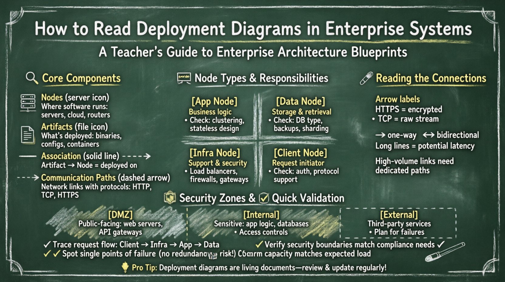
🔍 Core Components of a Deployment Diagram
To interpret a deployment diagram effectively, one must first recognize the standard symbols and their semantic meanings. These diagrams are typically constructed using a standardized notation that ensures consistency across documentation. The primary building blocks include nodes, artifacts, and communication paths.
- Nodes: These represent the physical or virtual computing resources where software runs. A node can be a server, a database machine, a router, or even a cloud instance. In enterprise systems, nodes are rarely standalone; they are grouped into clusters or tiers.
- Artifacts: These are the tangible pieces of software deployed onto the nodes. An artifact can be a compiled binary, a configuration file, a container image, or a database schema. The diagram shows which artifact resides on which node.
- Associations: Lines connecting nodes and artifacts indicate the relationship of deployment. A solid line usually implies that the artifact is physically deployed on the node.
- Communication Paths: These lines connect nodes to each other, representing network connectivity. They often include labels describing the protocol used, such as HTTP, TCP/IP, or secure socket layers.
Understanding these elements allows you to trace the flow of data and control through the system. It transforms a static image into a dynamic model of how the enterprise operates.
🖥️ Analyzing Node Types and Responsibilities
In an enterprise environment, nodes are categorized based on their function. A deployment diagram should clearly distinguish between different types of processing power and storage. Misinterpreting these categories can lead to architectural flaws during implementation.
1. Application Nodes
These nodes host the business logic of the system. They are often clustered to handle load balancing and failover. When analyzing these nodes, look for:
- Replication: Are there multiple nodes performing the same function? This indicates redundancy.
- State Management: Does the node store session data, or is it stateless? Stateless nodes are easier to scale.
- Resource Allocation: Are the nodes labeled with specific resource constraints? This hints at performance tuning requirements.
2. Data Nodes
Data storage is a critical pillar of enterprise systems. These nodes manage persistence and retrieval of information. Key indicators to observe include:
- Database Type: Is it relational or non-relational? The diagram may specify the artifact type.
- Partitioning: Are data nodes sharded or distributed across multiple physical locations?
- Backup Mechanisms: Are there distinct nodes designated for replication or archival purposes?
3. Infrastructure Nodes
These are the supporting elements that enable the application and data nodes to function. They include:
- Load Balancers: Devices that distribute traffic across application nodes.
- Gateways: Entry points for external traffic, often handling protocol translation.
- Firewalls: Security devices that filter incoming and outgoing network traffic.
| Node Type | Primary Responsibility | Key Interpretation Points |
|---|---|---|
| Application Node | Executes business logic | Clustering, Statefulness, Scaling Strategy |
| Data Node | Persists and retrieves data | Consistency, Availability, Backup Location |
| Infrastructure Node | Supports connectivity and security | Latency, Security Zones, Traffic Flow |
| Client Node | Initiates requests | Protocol Support, Authentication Method |
🔗 Interpreting Communication Paths
The lines connecting nodes are not merely decorative; they define the flow of information. In complex systems, the nature of these connections determines performance and security posture. Proper interpretation involves looking beyond the line itself to the metadata attached to it.
- Protocol Labels: A connection labeled “HTTPS” implies encryption at rest and in transit. A connection labeled “TCP” might imply a lower-level, unencrypted stream. This distinction is vital for security audits.
- Directionality: Arrows indicate the direction of data flow. A two-way arrow suggests bidirectional communication, while a single arrow implies a push or pull model.
- Latency Implications: Long-distance connections between nodes (e.g., across different regions) introduce latency. Interpreting the diagram requires visualizing the physical distance between the nodes.
- Bandwidth Constraints: Some diagrams include bandwidth labels. High-volume data transfers between nodes may require dedicated links or specific hardware configurations.
When tracing a request, follow the path from the client node through the infrastructure nodes to the application nodes, and finally to the data nodes. This trace reveals the complete lifecycle of a transaction within the system.
🛡️ Security Zones and Trust Boundaries
Enterprise systems rarely exist in a vacuum. They operate within defined security zones. A deployment diagram often uses shaded areas or named containers to represent these zones. Interpreting these zones is crucial for understanding trust relationships.
1. The DMZ (Demilitarized Zone)
This area typically hosts public-facing components. When you see nodes placed in a DMZ, understand that they are exposed to external networks but are isolated from the internal core. They often handle:
- Web servers accepting user traffic.
- API gateways managing external access.
- Proxy servers for caching.
2. The Internal Network
Nodes here are not directly accessible from the internet. They contain sensitive logic and data. Interpretation here focuses on:
- Access controls required to reach these nodes.
- The number of hops required to reach a data node from an application node.
- Network segmentation between different internal tiers.
3. External Dependencies
Systems often rely on third-party services. These appear as nodes outside the main boundary. Identifying these is important for risk assessment. If an external node fails, how does the internal system react? The diagram should ideally show fallback paths or error handling mechanisms.
⚡ Performance and Scalability Analysis
A deployment diagram is not just a map; it is a performance model. By examining the layout, architects can identify potential bottlenecks before deployment occurs.
1. Single Points of Failure (SPOF)
Look for nodes that have no redundancy. If a single node handles all traffic for a specific function, its failure halts that function. In a well-designed diagram, critical nodes should appear in pairs or clusters.
2. Load Balancing Strategy
Check how traffic enters the system. Is there a dedicated load balancer node? If so, how is it configured? Round-robin, least connections, or geographic routing? The diagram might not specify the algorithm, but the presence of the node indicates the intent to distribute load.
3. Data Partitioning
If the diagram shows multiple data nodes, are they partitioning the data? This is common in distributed databases. Interpret the labels to see if data is split by region, by customer ID, or by time range. This impacts query performance significantly.
4. Caching Layers
Look for nodes positioned between the application and data layers. These often represent caching mechanisms. Their presence reduces database load and improves response times. Interpreting their location helps estimate cache hit ratios.
🔄 Deployment Strategies and Lifecycle
The diagram represents a snapshot in time, but it implies a lifecycle. How does the system evolve? Understanding the deployment strategy helps in planning updates and maintenance.
- Blue-Green Deployment: Does the diagram show two identical environments running simultaneously? This suggests a strategy where traffic is switched between environments to minimize downtime.
- Canary Releases: Are there specific nodes designated for a small subset of users? This indicates a controlled rollout strategy.
- Rolling Updates: Does the diagram imply a sequence of node updates? This is common in large clusters where nodes are updated one by one.
When reviewing the diagram for change management, ask how the artifacts are versioned. Are the artifacts labeled with version numbers? This helps in tracking which specific code is running on which node.
📋 Validating Consistency and Completeness
Once the diagram is interpreted, it must be validated against requirements. This step ensures the physical design matches the logical architecture.
1. Logical vs. Physical Alignment
Compare the deployment diagram with the system architecture diagram. Do the components match? If the logical diagram shows three tiers, the deployment diagram should reflect that structure. Mismatches often indicate a gap in the design process.
2. Compliance Requirements
Enterprise systems must adhere to regulations. Check if the diagram reflects data residency laws. For example, if data must stay within a specific country, are the data nodes located in that region? The diagram provides the evidence for compliance audits.
3. Capacity Planning
Does the hardware specification match the expected load? If the diagram shows a single server for a high-traffic application, it suggests a capacity issue. Look for notes regarding CPU, RAM, and storage capacity attached to the nodes.
🛠️ Common Challenges in Interpretation
Even experienced architects face hurdles when reading deployment diagrams. Being aware of common pitfalls improves accuracy.
- Ambiguous Labels: If a connection is unlabeled, do not assume the protocol. Verify the standard documentation or context.
- Overcrowding: Large diagrams often become cluttered. Zoomed-in views or separate diagrams for specific zones may be necessary for clarity.
- Outdated Information: Diagrams are often neglected after the initial build. Ensure the diagram reflects the current state of the infrastructure. Verify with the operations team.
- Abstraction Levels: Some diagrams abstract away details like virtual machines. Recognize that a “Server” node might actually be a cluster of virtual instances.
🚀 Future-Proofing the Architecture
Interpreting the diagram also involves looking forward. Enterprise systems must adapt to new technologies. When reviewing the diagram, consider:
- Containerization: Are the artifacts designed to run in containers? This allows for easier portability between environments.
- Serverless Options: Are there nodes that could be replaced by serverless functions? This might reduce management overhead.
- Hybrid Cloud: Does the diagram show a mix of on-premise and cloud resources? This requires careful management of network boundaries.
By anticipating these changes, the diagram remains a relevant tool for decision-making over the long term. It serves as a foundation for modernization efforts.
📝 Summary of Key Interpretation Steps
To summarize the process of interpreting deployment diagrams in enterprise systems, follow this structured approach:
- Identify the Boundary: Define the system edge and external dependencies.
- Categorize Nodes: Distinguish between application, data, and infrastructure nodes.
- Trace Connections: Follow the data flow and note protocols and direction.
- Check Security: Verify zones and trust boundaries.
- Assess Redundancy: Look for clusters and failover mechanisms.
- Validate Requirements: Ensure the physical design meets logical and compliance needs.
Mastery of this skill reduces risk and improves communication among teams. It bridges the gap between high-level strategy and low-level implementation. By focusing on the structural and relational details within the diagram, organizations can maintain robust and resilient systems.
Remember that a deployment diagram is a living document. It evolves as the system grows. Regular updates and reviews ensure that the interpretation remains accurate. This continuous alignment is essential for the long-term health of enterprise infrastructure.

