


In the modern landscape of technology, infrastructure has evolved from simple server racks to intricate, distributed ecosystems. Managing this complexity without a visual representation is akin to navigating a city without a map. Deployment diagrams serve as that essential cartography, translating abstract logic into tangible topology. This guide explores how to create effective visualizations that reduce cognitive load and streamline operations.
🧠 The Cognitive Load of Undocumented Systems
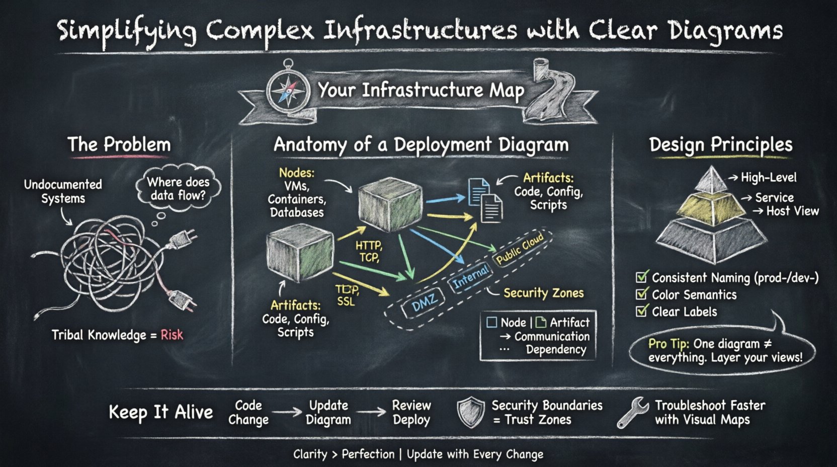
When infrastructure grows, the risk of miscommunication increases exponentially. Text-based documentation often fails to capture the spatial relationships between components. A developer might understand the code, but without a visual map, the flow of data between services remains obscured. This opacity leads to slower troubleshooting and increased risk during deployments.
Visual diagrams address several critical challenges:
- Shared Understanding: They provide a common language for developers, operations staff, and security teams.
- Rapid Onboarding: New team members can grasp the system architecture faster than reading extensive manuals.
- Dependency Mapping: Visual connections highlight critical paths and single points of failure.
- Security Auditing: Boundaries and access points become immediately visible.
Without these visuals, teams rely on tribal knowledge. If a key engineer leaves, that knowledge walks out with them. Diagrams preserve institutional memory and ensure continuity.
🛠️ Anatomy of an Effective Deployment Diagram
A deployment diagram focuses on the physical or virtual hardware where software artifacts run. It connects the logical design to the physical reality. To build a useful diagram, one must understand the core elements and how they interact.
Nodes and Execution Environments
Nodes represent the computational resources. These are the devices that host the software. In a generic context, these might include:
- Compute Instances: Virtual machines or containers that execute the application logic.
- Storage Devices: Databases, file systems, or object storage buckets.
- Network Devices: Routers, firewalls, or load balancers that direct traffic.
- Gateways: Entry points for external traffic.
Each node should be labeled clearly. Ambiguity in naming conventions leads to confusion. For example, distinguishing between a “Development Node” and a “Production Node” is vital for operational safety.
Artifacts and Deployments
Artifacts are the deployable units of software. This includes binaries, configuration files, scripts, and container images. The diagram must show where these artifacts reside and how they are distributed.
- Storage Locations: Where is the artifact stored before deployment?
- Deployment Targets: Which nodes receive the artifact?
- Versioning: Does the diagram indicate the specific version installed on a node?
Connecting artifacts to nodes demonstrates the relationship between code and hardware. This is crucial for understanding licensing, compatibility, and resource requirements.
Communication Paths
Lines in a deployment diagram represent communication channels. These can be physical cables, virtual networks, or logical protocols. The direction of the line indicates the flow of data.
- Request Flow: How does a user request reach the application?
- Data Sync: How do databases replicate data across regions?
- Management Traffic: How does the monitoring system collect logs?
Labeling these connections with protocol types (e.g., HTTP, TCP, SSL) adds necessary technical depth without cluttering the visual.
📊 Elements Comparison
Understanding the distinction between different diagram elements helps in maintaining clarity. The following table outlines common components and their functions.
| Element | Function | Visual Representation |
|---|---|---|
| Node | Computational resource hosting software | 3D Box or Cylinder |
| Artifact | Deployable software unit | Document Icon |
| Association | Relationship between artifacts and nodes | Solid Line |
| Dependency | Logical reliance (e.g., API usage) | Dashed Arrow |
| Grouping | Logical or physical boundaries | Dashed Rectangle |
🎨 Design Principles for Clarity
Creating a diagram is not just about drawing boxes and lines. It is about communicating intent. A cluttered diagram is often more confusing than no diagram at all. Adhering to specific design principles ensures the output remains useful over time.
Managing Abstraction Levels
One of the most common mistakes is trying to show every single detail in one view. A single diagram cannot effectively show the entire enterprise infrastructure. Instead, use a layered approach.
- High-Level View: Shows regions, major data centers, and global load balancers.
- Service View: Focuses on specific application clusters and their internal dependencies.
- Host View: Details the specific configuration of individual servers or containers.
Linking these diagrams allows stakeholders to drill down when necessary without overwhelming the initial overview. This hierarchy respects the viewer’s cognitive capacity.
Consistent Naming Conventions
Labels must follow a strict standard. Inconsistent naming makes cross-referencing impossible. Consider the following rules:
- Prefixes: Use prefixes like
prod-ordev-to denote environment. - Functional Names: Use names that describe the function, not just the hostname (e.g., Payment Gateway instead of Server-04).
- Abbreviations: Define all abbreviations in a legend if space is limited.
Color and Shape Semantics
Visual cues should convey meaning. Avoid using colors arbitrarily. Establish a legend that defines what specific colors or shapes indicate.
- Security Zones: Use distinct border styles or background colors for DMZs, internal networks, and public clouds.
- Criticality: Highlight high-availability components differently than standard ones.
- Ownership: Differentiate components owned by different teams using distinct icons.
🤝 Communication Across Teams
Deployment diagrams are not static documents; they are communication tools. They bridge the gap between different disciplines within an organization.
DevOps Collaboration
Developers need to know where their code runs. Operations staff need to know how to provision the resources. A deployment diagram aligns these perspectives. It answers the question: “If I deploy this artifact, where does it go?”
- Resource Requirements: The diagram shows CPU and memory allocations per node.
- Network Topology: It clarifies which services can talk to each other.
- Deployment Pipelines: It visualizes the path from source control to production.
Security and Compliance
Security teams rely on diagrams to assess risk. They look for data flow paths that might expose sensitive information. They check for proper segmentation between zones.
- Data Classification: Identify where sensitive data resides.
- Access Control: Show where firewalls or authentication gates exist.
- Regulatory Boundaries: Indicate if data crosses geographical or legal borders.
🔄 Maintenance and Version Control
A diagram that is outdated is worse than no diagram. Infrastructure changes constantly. New services are added, old ones are retired, and configurations shift. If the diagram does not reflect reality, it creates technical debt.
Integration with Workflow
To keep diagrams current, they must be part of the development lifecycle. Do not treat diagramming as a separate, occasional task. Integrate it into the change management process.
- Change Requests: Require an updated diagram for significant infrastructure changes.
- Automated Generation: Where possible, generate diagrams from configuration management tools to reduce manual effort.
- Review Gates: Include diagram review in pull request processes.
Versioning Diagrams
Just like code, diagrams need version control. Store them in the same repository as the infrastructure configuration. This ensures traceability.
- Tagging: Tag diagram versions to match specific release cycles.
- History: Maintain a history of changes to understand how the architecture evolved.
- Comparison: Ability to compare v1.0 vs v2.0 to see what changed.
Handling Legacy Systems
Not every component will be modern. Legacy systems often lack documentation. When mapping these, focus on the interfaces and connections rather than internal logic.
- Black Box Approach: Treat unknown internals as a black box node.
- Interface Focus: Document the inputs and outputs clearly.
- Decommissioning Plans: Mark legacy nodes with a status indicating planned removal.
🛡️ Security Boundaries and Trust Zones
Security is a primary concern in modern infrastructure. Deployment diagrams help visualize trust boundaries. A trust boundary is where the level of security changes, such as moving from the public internet to an internal network.
- Perimeter Security: Show where firewalls and WAFs sit.
- Data Segregation: Show where sensitive data is isolated.
- Identity Zones: Indicate where authentication services are located.
Clear visualization of these boundaries helps auditors verify compliance with standards like PCI-DSS or HIPAA. It makes the invisible visible.
📉 Troubleshooting and Incident Response
When an incident occurs, time is critical. A clear diagram allows the team to locate the failure point quickly. Instead of guessing which service is down, the team can follow the connection lines.
- Root Cause Analysis: Trace the error back to the source.
- Impact Assessment: Determine which downstream services are affected.
- Recovery Steps: The diagram serves as a checklist for restoring services.
Having a reference diagram in the incident channel reduces the time to resolution. It removes the need to ask “Where does this service live?” during a crisis.
🌐 Future-Proofing the Visualization
Technology trends shift. Microservices, serverless, and edge computing change how we deploy. Diagrams must be flexible enough to adapt to these changes without losing their core value.
- Abstraction: Focus on logical connections rather than specific hardware.
- Standardization: Use standard symbols that do not become obsolete.
- Scalability: Ensure the format can handle more nodes as the system grows.
📝 Final Thoughts on Infrastructure Mapping
Building clear deployment diagrams is an investment in operational stability. It reduces the time spent deciphering complex systems and minimizes the risk of human error. By following established practices, teams can create visuals that serve as reliable references for years.
The goal is not perfection, but utility. A diagram that is 90% accurate and easy to read is better than a perfect one that no one understands. Prioritize clarity, maintain consistency, and keep the maps updated. In doing so, you transform chaos into order and uncertainty into confidence.
Start today by auditing your existing documentation. Identify the gaps and begin drawing. The complexity of infrastructure is inevitable, but the confusion surrounding it is optional.